10 Typography Do's and Don'ts
Typography has a massive impact on the success of a design. There are tens and thousands of available fonts out there. Isn’t it tiring to see good designs ruined by awful typography choices?
There are a few rules when it comes to typography. Every designer must know how to pick and choose the best typography approach to elevate their works.
Many will agree on this, bad texts are a huge pet peeve to any designer. Good typography will help your design look more professional while bad typography will surely give off an amateur or beginner-designer vibe.
Typography is a particular art in itself. Those who have a natural knack for typography are gifted in a sense but don’t worry if you’re still struggling to get it right. In this piece, we’ll go through the biggest do’s and don’ts to help you master typography.
In need of a skilled designer that can create stunning graphics and include the perfect typography? Top Design Firms has compiled a list of the best graphic designers so your designs can pop.
Need help selecting a company?
Based on your budget, timeline, and specifications we can help you build a shortlist of companies that perfectly matches your project needs. Get started by submitting your project details.
Typography vs. Typeface vs. Font
By definition, typography is the art and practice of arranging texts to ensure legibility and visibility. Its aim is to make everything clear and appealing to the reader, enhancing the impact of designs.
For some, understanding the differences between typography, typefaces, and fonts can be tricky. To clear things up, a typeface is essentially a set of design characteristics of a particular style of lettering. They are type families that can include one or more fonts and examples are the Sans Serif group, Script group, and Old Style group.
The word font was popularized by Microsoft, and it’s derived from the French word “fonte”. It refers to the same type with a unified design including style, weight, and accessories. Neue and Helvetica are examples of fonts.
The Power of Typography
As emphasized, great typography can elevate a design. Improving its balance and visual hierarchy. When applied to packaging designs, it can help buyers clearly understand the texts from far away and make them more desirable.
In graphic design, strong typography can effectively convey its message to its intended viewers. It can draw their eyes to the most important information and help with user experience.
Read here: “Typography Design: 5 Elements in Typography Layouts”
Typography Do's and Don’ts
It’s the duty of every designer to understand typography and master it to improve their work. Here are the main do’s and don'ts you should know:
- Do balance readability and legibility
- Don’t overdo text spacing
- Do utilize containment devices
- Don’t stretch your fonts
- Do consider personality and branding
- Don’t go overboard with shadows and embedments
- Do look at the bigger picture
- Don’t use too many typefaces
- Do study about protected fonts
- Don’t forget about contrast
Do Balance Readability and Legibility
Readability is always the goal when designing, even if there are no texts involved. See, texts are additional elements that need to be balanced when designing, so it’s especially important to be mindful of readability and legibility.
You can create the best designs and include fancy fonts but if your readers are having a hard time figuring out what it says, it’s not doing its job. After all, no viewer wants to have a hard time understanding the text in a label or a graphic.
Don’t Overdo Text Spacing
Every designer must know what is kerning — it is the space between each individual letter and character. When it comes to incorporating a hefty amount of text in a design, some designers tend to tighten their kerning to fit the content.
However, if you go too tight, you can lose readability. It’s important to learn how to find the perfect footing in between what is too loose or too tight.
In addition, kerning isn’t the only space you need to worry about. Finding the right line spacing balance is as imperative as kerning.
Give your text room to breathe and make sure you take advantage of the power of the white spaces in between each line to improve readability. If not, readers might have a tough time tracking the lines. Again, balance is the key here so don’t overplay it.
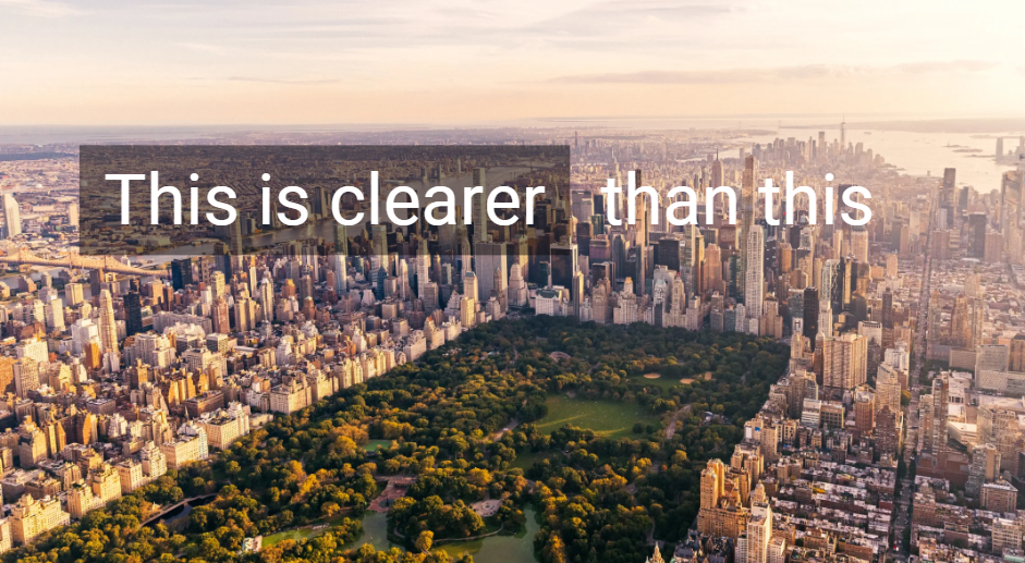
Do Utilize Containment Devices
Have you ever felt frustrated seeing texts over busy designs? Don’t be that designer and utilize containment devices for your designs. The common solution to busy designs is to include a box and lessen its opacity to improve readability.
Be wary, though, if you use it in a ton of your designs, it can get pretty old eventually and make you look like a one-trick pony that uses templates, so try to come up with other ways to make your texts pop as you get better.
Don’t Stretch Your Fonts
Overstretching fonts should be a crime. Modifying your fonts using the pen tool in Photoshop to give them character is understandable. In fact, that shows great skills but modifying is different from stretching them.
When fonts are stretched too far, they tend to look wonky and untidy. Distorted texts make it harder to read and ruin their pixels. Minuscule adjustments are still tolerable, but stretching them to the point where they look lazy and unprofessional is a big no.
Do Consider Personality and Branding
When it comes to designing for brands, consistency, and personalization is the name of the game. Every designer and business owner must know that there are certain fonts that businesses should follow from their brand guidelines.
Brand identity is everything. Imagine if Apple used fancy fonts instead of their simple sans serif fonts; wouldn’t that look out of the ordinary and out of character for them? Consistency when using typefaces should be a priority.
If you’re not designing for a brand, chose typefaces that carry the same personality and compliments the design you’re going for. Consider if it fits the message and vibe you’re aiming for.
Don’t Go Overboard with Shadows and Embedments
Using shadows and embedments is natural when designing. However, getting carried away with too intense or too many will make your design look tacky. Nothing screams amateur more than overdoing it with extras like that. Keep it simple and only use them when necessary.
Also, using shadows for headers and headings is common, but don’t overuse them. If you’ve already added it there, don’t include it on the body.
Do Look at the Bigger Picture
When a cool idea suddenly comes into mind or when a good font catches your eye, it’s easy to get swayed and deviate from the original intent of a design.
Never lose sight of what your true objective is when designing. Always take your time to look at the bigger picture to make sure you pick the optimal typeface for your work.
Ask yourself fundamental questions like:
- What is the goal of the design?
- Does the typeface work for the context?
- What medium will it be on?
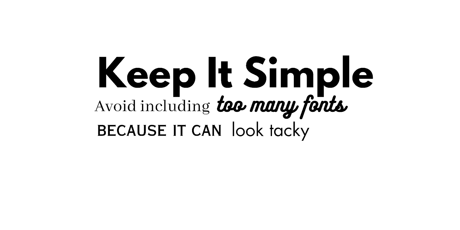
Don’t Use Too Many Typefaces
One of the biggest cardinal sins in design is using too many typefaces. While using different typefaces can help establish a visual hierarchy and guide readers from the most crucial information to the least, too many can be distracting.
Mixing and matching won’t hurt, of course, but the rule of thumb when it comes to incorporating different fonts stick to only using two or three at max. Four will be overkill and unnecessary. Also, don’t forget to use fonts that complement each other and avoid clashing styles.
Do Study About Protected Fonts
According to the Georgia Lawyers For The Arts, fonts are protectable under the copyright law of the United States. However, typefaces are not protectable. Meaning, if you select a font that is protected and use it for commercial purposes, you may be struck with copyright infringement claims.
There are thousands of free fonts available for download for personal use, but be careful because a lot of those are just pirated versions of protected fonts.
There are plenty of resources you can look at, so study these laws, especially the ones where you’re from. Be careful because a brand logo you just created might have protected fonts.
Don’t Forget About Contrast
Contrast is powerful, and it’s the foundation of great design. In typography, it’s another element that will affect readability and visibility.
If there’s no contrast between the text and the background you’ve chosen, your readers will have trouble understanding the content.
The human eye naturally merges the elements that share the same color or shape from afar. With proper contrast, you can make a poster legible even from a reasonable distance. It can also help you establish a visual hierarchy, allowing the texts and design elements to stand out as you intended.
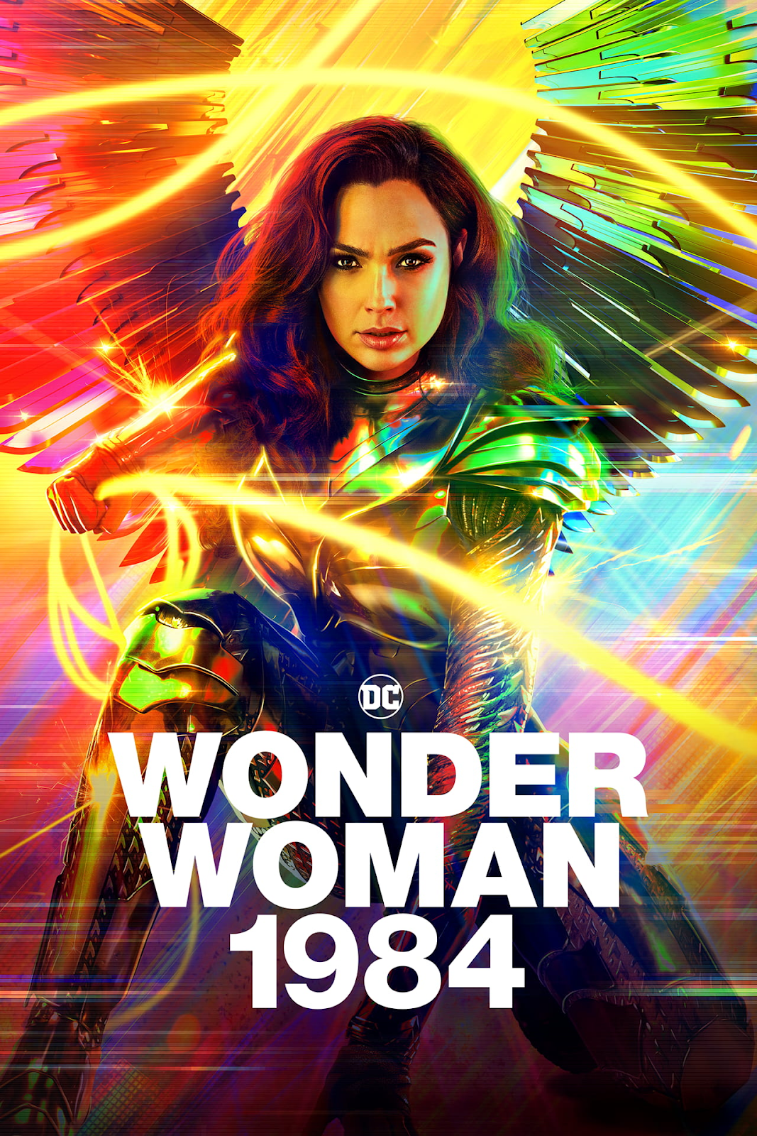
A great example of this is professionally made movie posters. Graphic designers make sure your eye immediately goes to the title first as they want the moviegoers and fans to quickly know what the film is.
Typography Affects Conversion
Typography has the capacity to invoke emotions, communicate effectively, and even boost the effectiveness of a message. Combining it with good color and stunning imagery, typography is one of the essential building blocks that help build successful designs that entice customers, convincing them to purchase products or services.
Using the right font could be the difference between better sales and lackluster results. Around 72% of consumers nowadays judge packaging designs for their purchase choices and another 75% judge businesses by their websites.
If your web design has poor typography, customers may see it as unprofessional which might deter them from reading more about your message. In products, typography adds to the appeal of your product, making it look more premium and high quality compared to those with bad readability.
Typography is all around us. From infographics to magazines, it's a must to understand your message to know which approach will make it easier for the intended audience to digest information.
Lastly, you shouldn’t be overthinking these rules. As every designer will say, it’s okay to bend the rules sometimes if it works. These do’s and don’ts are just guidelines to help you find your footing and master typography.
Partner with an experienced designer and typography woes won’t be your concern. Find and connect with the leading graphic designers in Top Design Firms.
Additional Readings:
Need help selecting a company?
Based on your budget, timeline, and specifications we can help you build a shortlist of companies that perfectly matches your project needs. Get started by submitting your project details.