5 Typographic Ads & What You Can Learn From Them
Great advertising is all about catching your audience’s attention and delivering your message. It should portray your brand, demonstrate your business values, and most of all, be memorable.
Typography is a great tool for advertisers because it engages viewers and helps them process information.
Whether you’re developing an online, TV, or print ad, typographic ads are a great way to communicate with consumers and build brand recognition. Here are 5 ways that popular brands have used typography in their advertising campaigns and why they were effective.
Need help selecting a company?
Based on your budget, timeline, and specifications we can help you build a shortlist of companies that perfectly matches your project needs. Get started by submitting your project details.
Nike: Get Creative with Color, Weight, & Size
Source: Pinterest
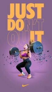
Nike’s slogan, “Just Do It” is a core component of their brand. In this ad, they used their typographic layout to emphasize their recognizable slogan. The background is purple, but they use bright yellow lettering to create contrast and make their typography pop.
The top two-thirds of the print ad is covered using a bold san serif font that reads “Just Don’t Quit.” However, only some of the letters are filled in, while the end of “Don’t” and the beginning of “Quit” are simply outlined. If viewers focus on the letters that are filled in, the text clearly spells out “Just Do It.”
Combined with the Nike swoosh at the bottom of the ad, this clever ad is clearly for Nike gear. By messing around with the formatting of their text, they were able to reemphasize their brand and call attention to their message.
Coca-Cola: Use Other Materials
Source: Pinterest
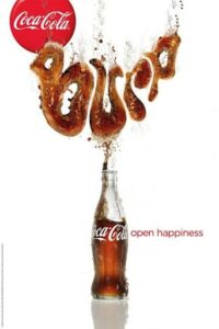
Coca-Cola got creative in this campaign by using their product to spell out sounds associated with drinking soda. This ad, for example, spells out “Burp.” The designer used brown and shading to create the look of carbonated soda for each of the letters.
Additionally, they created a fluid outline for each of the letters to make it look like the drink was flowing out of the bottle. Because it looks like the letters are floating upwards, it appears refreshing and light, appealing to consumers.
Coca-Cola released several similar ads around the same time, using words and onomatopoeias such as “Gulp,” “Pssst,” and “Ahhhh.”
The decorative script contrasts the sans-serif font used for Coca-Cola’s slogan, “Open Happiness,” making it stand out even more.
Pepsi: Include Animation
Source: SlocumStudio
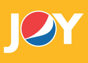
In this ad, Pepsi used a solid sans-serif font that is clean and crisp, just like their drink. The white letters are bold and are evenly spaced, with the “O” perfectly centered in the middle.
However, the “O” is formed using Pepsi’s globe-shaped logo. As a result, the viewer immediately knows what they’re advertising. At the same time, this ad associates the soft drink brand with the feeling of “joy.”
This ad is elevated by the fact that it is kinetic as well. Through animation, the logo rolls into place, grabbing the viewer’s attention.
Got Milk?: Keep it Simple
Source: Twitter
The iconic “Got Milk?” campaign was created by the advertising firm Goodby, Silverstein & Partners and premiered in 1993. Ever since, the slogan has been used to promote milk sales across the country.
Because the campaign has been running for so long and is so widespread, it’s one of the most recognizable marketing campaigns in the United States.
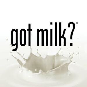
The slogan is so iconic that it has become a staple of their ads, often appearing under a picture of a celebrity with a milk mustache. This typographic ad, however, relies solely on the just-as-famous “Got Milk?” font.
The font is Phenix-American, which is a part of the sans-serif typeface. Known for its bold and sharp look, this font really stands out against an all-white background. Phenix-American has been associated with the “Got Milk?” campaign since it was first launched and is a huge part of the reason why it’s so recognizable.
Because it’s so easy to read, it looks good on corporate stationery, in print ads, in magazines, and on packaging. By choosing a sleek and simple font like this, you will ensure that viewers will understand your message even if they only glimpse your ad.
Use Typographic Ads to Grab Attention
Typographic ads use eye-catching fonts, colors, and text to grab their viewer’s attention. This is a great way to convey your message clearly and expand brand recognition.
If you’re planning to develop your own typographic ad, keep these well-known brand names in mind.
By getting creative with the color, weight, and size of their text, they were able to create unique and interesting ads that stand out. You too can create a memorable and effective ad by making your typography look like other materials or incorporating animation.
Just remember that you should keep your font simple and easy to read. This will ensure that anyone can read your ad and quickly understand what you’re trying to promote, whether they’re scrolling online, flipping channels, or skimming through a magazine.
Consider working with a top-notch graphic design company to develop an effective and eye-catching typographic ad.
Need help selecting a company?
Based on your budget, timeline, and specifications we can help you build a shortlist of companies that perfectly matches your project needs. Get started by submitting your project details.