Typography Design: 5 Elements in Typography Layouts
A great typography design can help guide readers through content, deliver a message more effectively, and enhance branding. As you design the typography for your company’s branding materials, the font, color, kerning, and alignment can have a major impact on the look and feel of your overall design.
Updated April 29, 2022
Need help selecting a company?
Based on your budget, timeline, and specifications we can help you build a shortlist of companies that perfectly matches your project needs. Get started by submitting your project details.
What is Typography?
Typography is how designers arrange letters and text. Sometimes this means creating eye-catching titles or unique typographic logos, but often the main purpose is simply to convey a message.
By making small tweaks to the layout of their text, graphic designers are able to create hierarchy, grab their audience’s attention, and deliver their message more effectively.
Words and letters do more than deliver a message to a reader — they're also a major design element that can help you create brand awareness and guide readers through your content.
As such, designers need to think about the personality, tone, and function of their designs. Is the brand playful or more serious? Are they trying to grab the audience’s attention or are they simply stating facts?
These typography design elements can help companies create a unique look that effectively conveys their message.
Are you looking for a graphic design partner? Check out our directory of top design companies in your area.
Typeface & Font
Both the typeface and font can have an impact on how your brand is portrayed or your message is received. While these design elements may seem like a small decision, your choice can have a huge impact on how your message is received.
Typeface vs. Font: What's the Difference?
Fonts refer to the weight, width, and style of the text, while a typeface is a text style defined by the design features, such as serifs.
In fact, studies have shown that different fonts have emotions and personalities associated with them. Serif fonts were rated as practical and mature, while sans serif fonts had very few personality associations.
In comparison, script fonts, which are defined by a fluid stroke, are considered feminine while sharp and sleek modern fonts are considered more professional and masculine.
Consider the fonts in the image below. Each is associated with different characteristics.
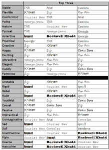
Source: HubSpot
Which one is right for your brand? Consider how the font used in this typographic logo impacts the client’s brand:
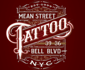
Source: Every Tuesday
This tattoo parlor uses a serif font in their logo — the slight projection in the finishing stroke of each letter creates a sharp look that is consistent with the text’s message. The “T” in tattoo, for example, is pointed at the bottom and is reminiscent of a needle used to create tattoos.
Before choosing your font, consider what the purpose of your text is. Readability is key for getting your point across.
On top of that, the designer uses many text decorations, such as flourishes and line patterns, similar to traditional tattoos and old-timey tattoo parlors. This, in turn, serves to drive home their point even more.
Remember that some of these fonts are easier to read than others, especially in large blocks of text. As a result, you can get more creative with typographic logos, ads, and titles, but content should use more simple fonts.
Script fonts like Gigi, for example, are unsuitable for articles and blog posts. Instead, consider using a serif text like Georgia for header text and sans serif text like Arial or Helvetica for copy.
10 Popular Fonts to Use in Your Typography Design
- Helvetica
- Baskerville
- Times
- Akzidenz Grotesk
- Gotham
- Bodoni
- Futura
- Gill Sans
- Frutiger
- Rockwell
Additional reading, ‘20 Most Popular Fonts of All Time.’
2. Size and Weight
Size and weight play an important role in creating a hierarchy on your page. Larger and bolder text grabs the reader’s attention.
Again, consider the tattoo logo we analyzed in the previous section. “Tattoo” uses the largest font as well. By centering this text, putting it at an angle, and breaking the frame of the layout, the designer can draw their audience’s eyes to the most important part of the image — it is, after all, a tattoo parlor. Immediately, a reader or passerby can recognize what this image represents.
Font size is essential when creating editorial content. Titles and headers are often a size or two bigger than the body text and have more weight. 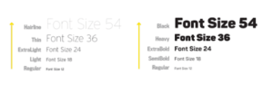
Source: Type-Ed
When designing a full page of text, the text size must be proportionate to the width of the column it’s in. Then, adjust the size of your font so there are about 50-70 characters per line. Once you’ve determined the size of the body text, choose the header size and select a proportionate weight.
3. Color
Color is at the core of every business’s brand and image. Your typography is just another tool you can use to promote your business. By using colors from your brand’s color palette, you can expand brand recognition. Referring back to the colors used in the tattoo parlor’s logo, bright white and yellow against a deep red background create contrast. This also emphasizes their brand. Deep red is symbolic of wrath and power, and the parlor is named “Mean Street Tattoo.”
4. Kerning
Spacing refers to the general space between letters while kerning refers to how designers can adjust the space between specific letter pairs in order to improve readability. Both are important for providing a seamless look and legible text.
Kerning Definition
Kerning refers to how designers can adjust the space between specific letter pairs in order to improve readability
Without them, your typography can look off to a casual viewer. For example, check out this poster with poor kerning:
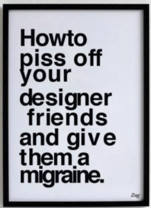
Source: Creative Bloq
Notice how the space between “How” and “to” is practically nonexistent while the “e” at the end of “give” is so far off to the right that it hardly looks like it’s a part of the same word. Doesn’t it drive you crazy? To improve your typography, follow these tips:
- Don’t rely on your software’s automatic kerning because it doesn’t always turn out well.
- Focus on how the design looks, not how much actual space there is between each letter.
- Understand the relationship between different letters
- Make sure there is enough space between each letter — tightly spaced letters are difficult to read
By following these rules, your layout will end up looking balanced and even.
5. Alignment
Typographic alignment is how a text flows with the rest of the page. There are four types of alignment: centered, left, right, and justified.
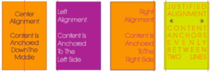
Source: PrintWand
Like anything else, there’s a time and place for each type of alignment. For example, the centered text creates a symmetrical look but isn’t great for full paragraphs because it doesn’t have a margin and is, consequently, more difficult to read.
Right alignments are funky as well, so they’re great for advertisements. However, left and justified alignments are the best for large blocks of text.
While a left alignment is most English speakers’ go-to, justified alignments are also great. Justified alignments anchor text evenly between two lines. This can create columns, which is great for publications like magazines and newspapers.
Use These Elements to Create Unique Typography Layouts
How graphic designers arrange their text can have a huge impact on the look and feel of their typography. By selecting the right font, size, and color, companies can emphasize their brand and create a hierarchy on each page.
At the same time, spacing and alignment play an important role in making sure your layout is organized and easy to read.
By combining these elements, designers are able to create a unique look that’s perfect for logos, ads, blogs, and articles.
Are you looking for a graphic design partner? Check out our directory of top design companies in your area.
Additional Reading
Need help selecting a company?
Based on your budget, timeline, and specifications we can help you build a shortlist of companies that perfectly matches your project needs. Get started by submitting your project details.