Design Concepts: Skeuomorphism vs Flat Design
Designers are divided over which design concept provides a better user experience: skeuomorphism vs. flat design vs. neumorphism. While the realistic elements associated with skeuomorphism make navigation more intuitive for new users, flat design is trendy, easier to read, and is optimal for mobile devices.
Updated April 8, 2022
Do you prefer realistic designs or more abstract compositions? For the last two decades, graphic designers, web designers, and developers have debated which design style — skeuomorphism vs flat design — provides the better user experience.
Recently, the answer seems to be even more convoluted than ever before. While each style has their own strengths, they both have their shortcomings.
A new style, known as neumorphism, combines these elements to improve user experience/user interface (UX/UI) while maintaining a modern look, but it’s not without its drawbacks.
This article examines how the strengths and weaknesses of these styles have impacted graphic design trends and how they continue to evolve.
Read, ‘50 Famous Graphic Design Companies to Checkout in 2022.’
Need help selecting a company?
Based on your budget, timeline, and specifications we can help you build a shortlist of companies that perfectly matches your project needs. Get started by submitting your project details.
Skeuomorphism vs. Flat Design vs Neumorphism
| Skeuomorphism | Flat Design | Neumorphism |
|
|
|
Looking for a graphic design company? Check out our shortlist of design firms.
What is Skeuomorphism?
Skeuomorphic designs are graphics that look like real-life objects. To create this look, digital graphic designers use three-dimensional effects, such as gradients, shadows, and highlights to create texture and depth.
While some designers use this to create realistic icons or logos that mimic real-life materials, others use it to create intuitive interfaces for complex platforms.
Skeuomorphism: Example 1
For example, this app designer mimicked a ‘70s era synthesizer when creating the design for a new app.
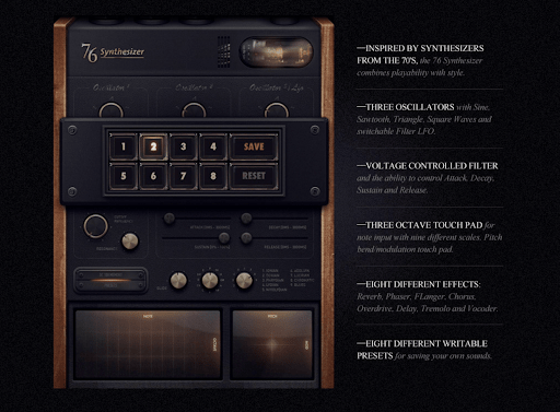
Source: CargoCollective
Because the platform is so similar to the object itself, it’s easy for users to interact with it on their tablets.
Benefits of Skeuomorphic Designs:
Generally, skeuomorphic designs can improve the UI and UX of a platform. For one, skeuomorphic designs are familiar, so people feel confident interacting with the design. They already know how it works, so they don’t need to watch a tutorial or go through any walkthroughs.
For example, a trash bin on a Mac looks just like a trash can in real life; people inherently know that they can drag and drop files they want to delete into the bin.
Additionally, three dimensional effects create depth, establish perspective, and contribute to the composition’s visual hierarchy. This helps users know what the most important elements of your design are and how they can navigate the platform. This also signifies which elements are interactive.
Skeuomorphism: Example 2
For example, designers make some elements, such as digital buttons, appear raised so users know that they should click on them, but they may use shading to create a sunken-in look for input fields and search tools.
This is particularly important for web designers and digital marketers who are looking to create engaging and eye-catching call-to-actions.
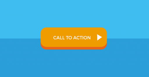
Source: Icons8
The design uses highlighting and shading to create a three-dimensional effect. As a result, it looks just like a button. This would stand out to new viewers on a page and clearly encourage them to click on it.
Drawbacks of Skeuomorphic Designs:
Until about 2007, skeuomorphism was all the rage, but that quickly shifted, ushering in a new age focused on flat design.
While skeuomorphic designs may seem like the way to go, features that have too many elements can be overwhelming and visually distracting to users.
When poorly organized, skeuomorphic designs can frustrate users.
Skeuomorphism: Example 3
For example, iBooks, the iOS app that allows users to download books straight to their phones, featured a bookshelf where users could see what they had saved.
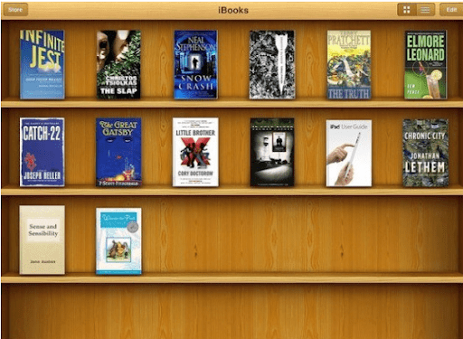
Source: Tech in Asia
However, this design was not effective because readers couldn’t see the titles. In the image above, can you read all of the titles? On top of that, the shelf itself didn’t add anything to the user experience. Without it, users still would know to click on the book in order to open it.
Furthermore, skeuomorphic designs have a lot of elements, require a lot of bandwidth and are resource-intensive. This, in turn, slows down loading time and can impact your bounce rate.
What is Flat Design?
Flat design is a design style that uses two-dimensional elements, minimalist shapes, and simple textures to create an abstract look.
Over the last few years, flat designs have become increasingly popular because people are more familiar with devices and platforms — they no longer need to rely on realism to create an intuitive interface.
In fact, when Apple launched iOS 7 in 2013, they dropped the skeuomorphic effects in favor of a clean, crisp look. Jony Ive, the former Chief Design Officer at Apple at the time, argued that people were comfortable enough with touch screens, they no longer needed real-world representations.
Source: Oficina Da Marca
Instead, they chose to emphasize readability and cleanliness with a flat design.
Since then, flat designs have been characterized by their use of white space, opaque elements, and limited shadows and animations.
Benefits of Flat Designs:
Flat designs are trendy because they look sophisticated and convey a sense of modernity. As a result, this design aesthetic is heavily favored by high-tech companies such as Apple and Microsoft.
These designs are often simple and follow a grid layout, so they’re more responsive and can easily be adapted for different screen sizes. As a result, it’s optimal for mobile devices that have slower internet speeds.
On top of that, the nonexistence of features such as gradients can lead to a quicker load time, which can prevent battery drainage and increase user engagement.
Drawbacks of Flat Designs:
Without three-dimensional effects like shadows, it’s not always clear when a feature is clickable. As a result, users often are unaware of how they can interact with the interface, impacting the user experience.
In fact, Jakob Nielsen, one of the co-founders of the Nielsen Norman Group, recently argued that flat designs hurt users and companies because they’re unable to differentiate between various UI elements. Instead, skeuomorphic elements are necessary to provide a top-notch user experience.
Neumorphic Designs: The Perfect Combo of Skeumorphic and Flat Designs
To remedy this, many designers opt for semi-skeuomorphic features, like light shading or slight shadows. For example, Whatagraph’s website primarily uses a flat design. However, on this page, they used shading to highlight animations that show how people can use their product.
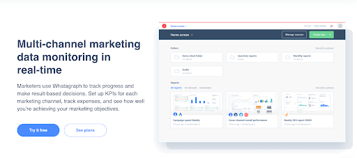
Source: Whatagraph
As a result, it looks like it’s a standalone piece of paper or webpage.
Although flat designs are trendy now, they may not be for long. Some designers consider this style to be boring and unoriginal. As a result, skeuomorphism seems to be making a comeback, but it isn’t as over-the-top dramatic as it was in the mid-2000s.
In 2020, Apple once again brought back skeuomorphic elements in Big Sur. For example the OS control center uses a heavy shadow for brightness control.
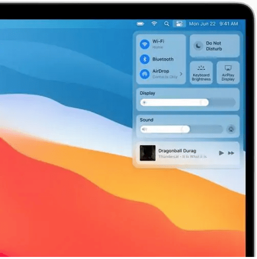
Source: Adobe
At the same time, they rely on the rules of flat design to maintain a clean user interface.
This “new” style utilizes skeumorphic and flat design elements and is now known as neumorphism.
What is Neumorphism?
Neumorphism is the perfect compromise between skeuomorphic and flat designs. It uses some elements of skeuomorphic designs, such as colors, shapes, gradients, and highlights to make the design more three dimensional.
For example, the image below shows 3 potential designs for a calculator: one skeuomorphic, one flat, and one neumorphic.
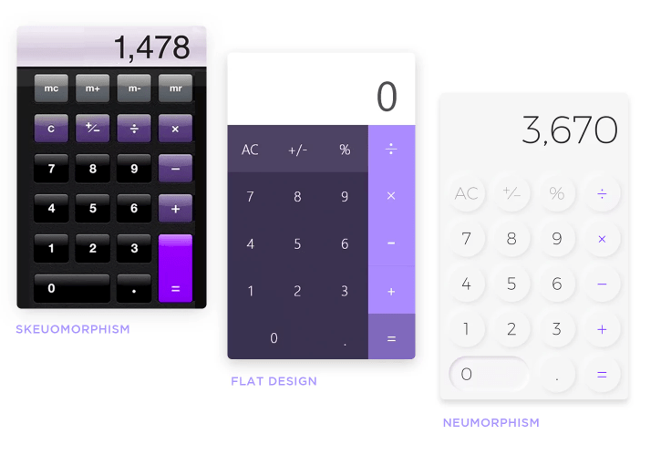
Source: Justinmind
The skeuomorphic design uses a lot of shading to make the buttons look three dimensional, while the flat design is entirely two dimensional. The neumorphic design has some shading around the edges of each button to show that users can click on it.
Benefits of Neumorphic Designs:
Neumorphism solves several of UX/UI problems associated with flat designs. Designers are able to use skeuomorphic elements to create visual hierarchies and improve the intuitiveness of a platform.
Consider the image above. On it’s own, the calculator’s flat design doesn’t indicate that users can press each button. Designs like this can make users second guess whether or not they pressed it. It’s a fairly common complaint for flat design interfaces and can lead to user frustration.
To remedy this problem, the neurmorphic design looks more three dimensional and ensures that users inherently know that they can press each button.
Drawbacks of Neumorphic Designs:
Because neumorphism is rather subtle, it can create accessibility issues, particularly for those with vision impairments. Poor quality screens or devices with low brightness and low contrast may be difficult to see.
As a result, neumorphic designs could negatively impact the user experience, despite the fact that it was initially created in order to resolve common interface issues.
However, experienced web designers and graphic designers will be able to execute the style and help companies achieve the best look.
Choose Which Design Concept is Right for Your Style
Over the last two decades, both skeuomorphism and flat designs have gone in and out of style. In that time span, we’ve discovered that both can either enhance or hinder the end user experience.
While skeuomorphic designs are often more intuitive and more familiar to users, their complexity can be confusing and they load slowly.
To combat this, modern designs are flat and lack three-dimensional elements. While these designs may be more mobile-friendly, users often don’t know how to interact with these elements.
As a result, many graphic design companies are working with web designers to implement characteristics of both design styles and optimize UX. In doing so, they hope to alleviate user frustration and improve their overall experience.
Neurorphism seeks to resolve these issues by including aspects of the skeuomorphism and combining them with flat designs to create a user-friendly interface and a sleek look.
Looking for a graphic design company? Check out our shortlist of design firms.
Need help selecting a company?
Based on your budget, timeline, and specifications we can help you build a shortlist of companies that perfectly matches your project needs. Get started by submitting your project details.