3 Experimental Typography Examples & Business Uses
Many companies avoid experimental typography in their branding materials. These typefaces differ from others by pushing the boundaries of industry standards and expectations. This may include variable fonts or artistic lettering used throughout branding materials.
Because it breaks the mold, experimental typography is often memorable and impactful. This can be attractive to brands that want to make a big impression on consumers.
However, if your typographic flair doesn’t align with your brand and goals, taking the risk on experimental typefaces can be detrimental.
This article will highlight 3 companies that strategically employ experimental typography and have seen success in doing so.
Need help selecting a company?
Based on your budget, timeline, and specifications we can help you build a shortlist of companies that perfectly matches your project needs. Get started by submitting your project details.
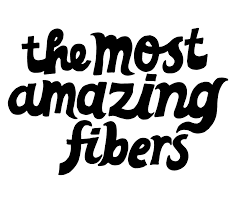
Experimental Typography: Oatly

Source: Oatly
Swedish company Oatly offers oat-based products, such as oat milk and ice cream, that serve as alternatives to their dairy-based counterparts.
Though the firm has been around for more than 25 years, it’s grown exponentially in the past few years thanks to internal and external factors. Arguably, the most pivotal of these factors was a rebranding effort they underwent in 2014.
Looking to capitalize on the growth in dairy alternative popularity that started early in the 2010s, Oatly turned to creative agency Forsman & Bodenfors for assistance.
The agency tackled the challenge uniquely, delivering intricate, info-forward package designs that would help the products stand out and help supplement Oatly’s small marketing budget.
A core component of the rebrand was the bold fonts employed by Forsman & Bodenfors. They contracted Swedish type studio Laudon Design, which delivered custom typefaces that are both fun and eye-catching.
With experimental typography in tow, the rebrand was a massive success. The campaign won several awards, including a Golden Egg Award, Sweden’s most prestigious award for communications excellence, in 2016.
The rebrand also helped the company grow exponentially. Oatly secured significant investments in 2016 that has allowed the firm to expand its operations internationally.
With their milk now serving as the official oat milk of coffeehouse giant Starbucks, the company has established itself as the premier oat milk brand thanks to the experimental typography affixed to their unique packaging.
Experimental Typography: Vimeo

Source: Vimeo
Particularly in the tech space, minimalist logos are prominent. However, by going against the grain with a bold wordmark, video-sharing platform Vimeo stands out from its competitors.
First seen by users in 2006, the light blue coloring and fun lettering help establish Vimeo as a hub for creativity, standing in stark contrast to the serious tone of other tech logos.
Despite these differences, Vimeo still maintains one key quality of their competitors’ logos: scalability. It can be shortened to a single “v” in white or blue, which works well as an app icon or clickable web page logo.
Vimeo’s logo is a great point of inspiration because, while it does employ experimental typography, it does not do so in a restrictive manner. In fact, the font used is close to the Black Rose font with some augmentation to the leading, or spacing between the letters.
Smartly executing an accessible strategy to separate itself from others in the field, Vimeo’s experimental typography serves as an excellent example for other companies looking to stand out.
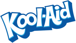
Experimental Typography: Kool-Aid

Source: Wikipedia
Regardless of the industry in which your company operates, one of the most critical marketing principles is understanding your target market’s nuances. Through the font employed in its logo, among other aspects of its branding, Kool-Aid does so in an impressive manner.
The flavored drink mix company has been around for over 90 years, but the brand’s current form took shape in the 1970s. At this time, the brand shifted its typeface to friendly white bubble letters accented by shades of blue.
With the brand’s mascot, the Kool-Aid Man, taking on his signature catchphrase shortly after, the brand’s current state was solidified by 1975.
While marketing a consumer staple in a fun, childlike manner was undoubtedly a risky move at the time, the experimental typography used to represent the brand resonates strongly with young people.
This appeal has contributed to the brand’s long-standing status as a summertime beverage of choice.
Although the Kool-Aid Man has undergone some alterations since the 1970s, the experimental typography seen in the wordmark has only seen minor tweaks.
Together, the two brand elements work to captivate consumers continually.
Experimental Typefaces Make Companies Stand Out
As tested with these three companies’ logos, employing experimental typography within a wordmark is a great way for a firm to elevate its brand and separate itself from competitors.
Oatly put experimental typography at the center of a rebrand that significantly accelerated its growth. Vimeo tweaked an existing font to create a dynamic, scalable logo. Kool-Aid picked fun lettering as a means of marketing a consumer staple to children.
These brands’ logos are a great example to follow if you want to implement experimental typography into your brand elements.
Need help selecting a company?
Based on your budget, timeline, and specifications we can help you build a shortlist of companies that perfectly matches your project needs. Get started by submitting your project details.