How to Use Lines in Graphic Design
Lines in graphic design — whether they’re vertical, horizontal, diagonal, zigzag, or curved — can be used to add style to your composition and emphasize the most important information in your design. Learn how you can use this graphic design element to convey emotions and create movement in your composition.
Lines, along with color, shape, texture, type, space, and image, lines are a key element of graphic design. However, lines are arguably the most important element because they’re the building blocks of your composition and can be used to add style and structure, divide space, or draw attention to the most important aspects of a design. Depending on the line’s weight, length, and context, designers can effectively convey emotions, define shapes, and create movement. Even invisible lines are an important aspect of your design as they effectively form structure and direction. This article will cover the different types of lines, what characteristics they convey, and how to use them to create style in your composition.
Need help selecting a company?
Based on your budget, timeline, and specifications we can help you build a shortlist of companies that perfectly matches your project needs. Get started by submitting your project details.
Types of Lines
- Vertical lines
- Horizontal lines
- Diagonal lines
- Zigzag lines
- Curved lines
There are five types of lines, and they each can have a different effect on your composition. As you’re designing, consider the message you’re trying to convey and how lines can help you communicate it.
Vertical Lines
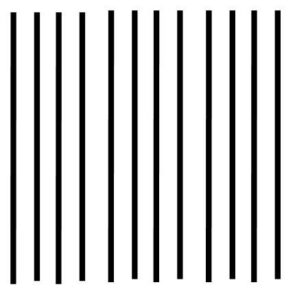 Source: Pinterest Vertical lines are straight and run up and down. Because they appear tall, they create height and strength in your composition. As a result, they represent grandeur. They’re also used in conjunction with horizontal lines to form a grid. Using this, you can plan an organized and neat layout.
Horizontal Lines
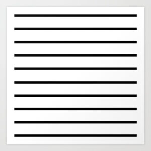 Source: Society 6 Horizontal lines are straight lines that run from left to right. Because they create the illusion of width and distance, they convey a sense of calm and peace.
Diagonal Lines
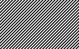 Source: Deviant Art Diagonal lines are also straight, but unlike horizontal or vertical lines, they are slanted. They move the viewer’s eyes in a specific direction and often are used to indicate movement.
Zigzag Lines
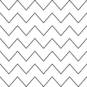 Source: Pinterest Zigzags are created from conjoined diagonal lines. Because they appear erratic, they’re often used to express electricity or anger. Consequently, a series of uneven zigzags that change direction abruptly imply chaos and give off a sense of energy.
Curved Lines
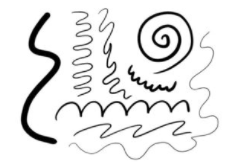 Source: YourArtPath Curved lines change direction slowly and can create wavy or spiral shapes. They convey feelings of comfort and are associated with elegance and beauty. As a result, they’re often used to complement
How to Use Lines in Your Design
- Add style
- Organize your design
- Emphasize important information
- Define information
Add Style
Graphic design companies can change up the style of their lines by adjusting the length, width, weight, texture, and style. In addition to solid lines, designers can rely on different formats such as dotted lines, dashes, or dots to create a unique look. Remember that repeated patterns and negative space can create lines as well. 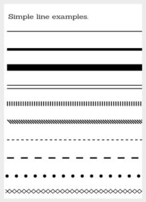 Source: 254 Online Whether your lines are decorative, used to contour an image, or are implied, consider how you can change up your look to better convey your message. A dashed line, for example, is often used to demonstrate that something should be cut out, such as a coupon. Consider the design below; how did this designer use different types of lines to decorate this poster?
 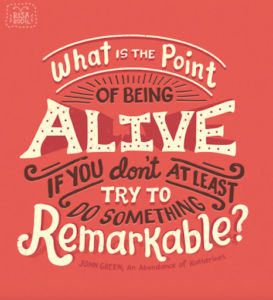 Source: Every Tuesday They used solid curved lines to create an arc that serves as the topmost boundary of the quote. Then they use line accents around“OF BEING,” making it appear like the sun is rising. They even use more curved lines to add style and symmetry towards the bottom of the design. These decorative elements draw the reader’s eye and tell them where to look. Finally, by creating a reverse arc at the bottom, the lines create structure.
Organize Your Design
Editorial layouts are typically designed using a grid of horizontal and vertical lines. This helps designers organize content, create structure, and form balance in their designs. For example, many e-commerce sites use these grids to showcase their products.  Source: Lululemon Notice how the negative space creates lines on the page. Each image is evenly spaced both horizontally and vertically. These lines create a clean design that makes it very easy for readers to read everything on the page.
Emphasize Important Information
Heavier, darker lines provide emphasis and can communicate stability, while thin lines are a little less noticeable. Consequently, if a designer wants to draw attention to a particular design feature, they may want to use a thicker, bolder line. However, they may choose to use smaller lines to create a subtle texture. Additionally, lines can direct your viewer’s eyes to the most important information on your page. Using leading lines, graphic designers can emphasize what they want viewers to focus on. Consider the lines used in this image: 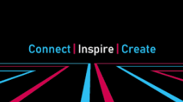 Source: JU Leading Lines Here, straight red and blue lines in the center of the page act like a road, directing viewers to look at the main word first: “Inspire.” Meanwhile, lines to the left and the right Without lines, viewers can have difficulty determining where to look. Text can get lost, and your message won’t ring as clear.
Divide Information
Finally, lines can be used to divide information. Take this New Year’s Eve poster, for example. 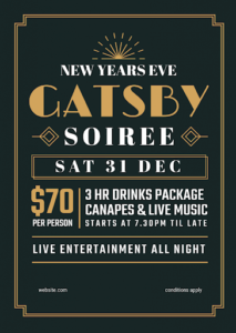 Source: Easil The designer used a vertical to divide the price and what the package included. At the same time, they used horizontal lines to highlight that there would be live entertainment all night. Using two overlapping boxes, they were also able to highlight the date. They also added decor by including two parallel lines around the border to create a gilded, roaring-twenties look and emphasize the theme.
Lines Are a Key Design Element
Lines are an essential element of any design. Whether they’re solid or dotted, horizontal or vertical, straight or curvy, they can be used to draw attention to the core features of your designs. Use them to add style to your page, organize your layout, or segment your composition.
Need help selecting a company?
Based on your budget, timeline, and specifications we can help you build a shortlist of companies that perfectly matches your project needs. Get started by submitting your project details.