The Eight Golden Rules of Interface Design
A well-designed UI is responsive, efficient, and accessible. By following The Eight Golden Rules of Interface Design, you can create a better interface that will improve engagement and increase sales. Here’s what you need to know.
A great user interface (UI) ensures that users can operate site, application, or program without issues.
For customer-facing websites, improved functionality and navigability result in higher click-through rates (CTR) and more sales when applicable. In other instances, a better UI results in higher user satisfaction.
Need help selecting a company?
Based on your budget, timeline, and specifications we can help you build a shortlist of companies that perfectly matches your project needs. Get started by submitting your project details.
What are the characteristics of a great interface design?
To answer this question, Ben Schneiderman, a professor of computer science at the University of Maryland, outlined what makes a great UI. Follow these eight golden rules to design a better interface:
- Consistency
- Use shortcuts
- Provide feedback
- Design dialog to yield closure
- Simplify to prevent errors
- Easily reverse actions
- Give users control
- Reduce short-term memory load
1. Consistency
Consistency makes your interface more intuitive for users so they can easily navigate your site. This will help them find functions they’re looking for and reduce any frustrations, improving usability and reducing your bounce rate.
To create consistency, use icons, colors, menus, and user flows that are familiar to users so they recognize what they should interact with and can expect how your platform will react in response. This also enhances branding.
For example, The Weather Channel allows users to check and save the forecast in multiple locations.
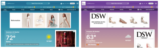
Source: The Weather Channel
Although each location is displayed with a different background color, their menu remains the same across the top and displays the same information below.
As a result, users can easily find out what the forecast is in each of these locations.
2. Use Shortcuts
If people can find a way to get something done faster and easier, they will. By adding shortcuts, you’ll streamline user flows and make your UX more efficient, helping frequent users access certain pages or perform actions as quickly as possible.
Keyboard shortcuts are among the most common shortcuts used, for example, using command+V to paste text into a Word document.
However, you can create other shortcuts for your customers that help them complete tasks with minimal effort. You could add menu items that allow users to get to their most frequently used pages.
A great way to improve usability is to follow the three-click rule — it should only take three clicks to get anywhere on your site.
3. Provide Feedback
No, this does not mean there should be a pop-up saying, “good job.” Instead, every action a user makes on your site should have a response in a reasonable amount of time.
If a user clicks on a page, the page should load quickly. If a page fails to load properly or swiftly, users are more likely to click away from your site.
You can also provide feedback by showing progress. E-commerce sites often use this to show how far along users are in the checkout process.

Source: Bolt
This helps users feel confident that they’re navigating your site correctly.
4. Design Dialog to Yield Closure
User flows should have a solid end. This helps users feel confident that they’ve accomplished their goal, whatever that may be.
In ecommerce web design, a great way to bring your user’s closure is to create a receipt of purchase after they’ve bought an item. A page thanking your users for their purchase ensures that their purchase went through and prevents repeat billing.
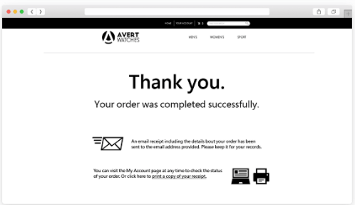
Source: Cloudways
A simple page that says, “Thank you. Your order was completed successfully,” boosts user confidence. You can also use this time to confirm their billing and shipping information to review it if there are any issues.
5. Simplify to Prevent Errors
Everybody makes mistakes; however, a simple error can cause issues for users and your business.
To prevent issues, your platform should be fool-proof. By creating an intuitive UI and providing step-by-step instructions, you can reduce these errors and give users a better impression of your platform.
For example, many websites auto-fill state acronyms or zip codes to prevent shipping and billing errors. It would be easy for users to accidentally type MA when, in reality, they meant to type MD, resulting in unusable data.
6. Easily Reverse Actions
If something does go wrong, users should be able to backtrack easily without completely refilling a form.
Imagine that you’re filling out a job application and you realize you uploaded an old resume. Poor interfaces require users to start from square one and input all of their information again.
This makes it more likely that users will give up and click away from the site. For recruiters, this would lead to fewer applications and fewer qualified candidates.
Instead, users should be able to click back to previous pages and address the issue.
7. Give Users Control
Users expect the interface to respond to their actions. Consequently, your site has to operate in the way they expect it to.
It should be easy to find the information they’re looking for and implement data-entry sequences that will help users use your platform.
Giving users more control over the interface reassures them and makes them feel more comfortable navigating their platform.
8. Reduce Short-Term Memory Load
People can only maintain a certain amount of information in their short-term memory at a time, and that number is surprisingly small. Psychological studies have shown that most adults can only store 5–9 items in their short term memory.
Users rely on recognition rather than recall to navigate sites.
This means that simple interfaces that use information hierarchy to convey information are more intuitive and easier to navigate.
Web designers should assume that users cannot remember information from one page to the next.
Follow These Rules to Enhance Your Interface Design
Your user interface should be intuitive and easy to use. By following the Eight Golden Rules of Interface Design, you can ensure your platform’s usability.
As you’re building your site, keep in mind that consistency, feedback, and simplicity can prevent errors and reduce user frustration. Use shortcuts, provide feedback, and reduce their need to rely on their memory to create a streamlined user flow.
Even if a user makes a mistake, they should go back and fix it as necessary.
By thinking about how users interact with the platform, you can adjust your design to enhance their experience.
If you’re planning to redesign your site or build a new platform, contact a web design specialist to build a great UI.
Need help selecting a company?
Based on your budget, timeline, and specifications we can help you build a shortlist of companies that perfectly matches your project needs. Get started by submitting your project details.