14 Website Banner Ideas & Tips
A great website design can help promote your brand and increase your conversion rate. As the first thing visitors see on your site, your website banner is a key component of your design. Implement these website banner ideas to make a great first impression.
A website banner is a header on your website that appears “above the fold,” or what users can see before they scroll.
Because it’s the first thing people see when they load your website, your website banner design can have a huge impact on how they perceive your brand and whether or not they continue to interact with your site.
In fact, it takes less than a second for people to form an opinion about your brand.
Need help selecting a company?
Based on your budget, timeline, and specifications we can help you build a shortlist of companies that perfectly matches your project needs. Get started by submitting your project details.
14 Website Banner Design Ideas & Tips
- Use a hero image
- Feature navigational functions
- Use brand assets
- Add a pop of color
- Select typography carefully
- Add animation
- Create layers with images, text, and graphics
- Use minimalism
- Add clickable calls-to-action (CTAs) and buttons
- Promote events
- Create a rotating banner
- Optimize for mobile
- Sticky your banner
- Add video
1. Use a Hero Image
A hero image is a large image the size of the banner. Images like this can be eye-catching and help you portray your brand.
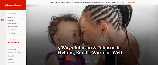
Source: Johnson & Johnson
However, to be effective, your images need to be high-quality. Because most computer screens have a minimum resolution of 1024 x 768 pixels, web designers should maintain a 16:9 ratio to achieve a crisp look.
2. Feature Navigational Functions
Navigational elements, such as your menu and search bar, are key to providing a positive user experience.
Users can get frustrated if they’re not able to navigate your site with ease. Many web designers suggest that users should be able to get anywhere on your website in just three clicks.
Vrbo, a vacation rental platform, does this by adding search bars and filters directly to their banner.
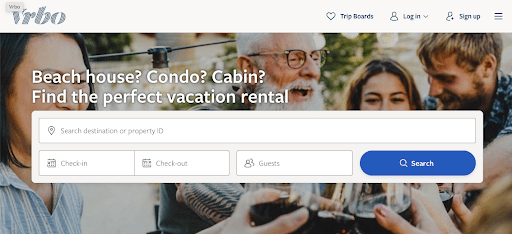
Source: Vrbo
In doing so, users can immediately begin searching for places to vacation based on where they want to go and when.
3. Use Brand Assets
Brand assets are features that help consumers identify your business and what you do. They can include anything from graphic elements to guidelines for copy.
When users first land on your homepage, they should immediately know what your company is about.
By adding brand assets to your banner, such as your brand colors, logo, or slogan, you can build brand recognition.
As one of the most recognizable brands in the world, Coca-Cola always uses their logo to make sure their customers associate their company with positive emotions.
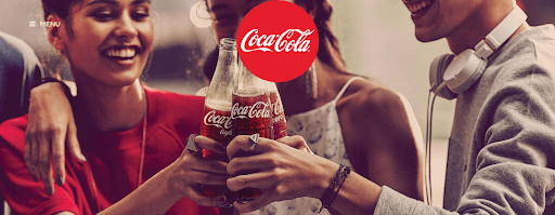
Source: Coca-Cola
Their website banner includes a picture of their product as the hero image and features their logo prominently in the middle of their banner.
4. Add a Pop of Color
Bright colors automatically capture your audience’s attention. Here, Tailwind, an athlete nutrition company, used orange in their banner to promote one of their products.
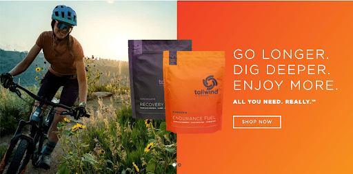
Source: Tailwind
Even though it stands out, it is well-chosen because it matches the packaging, which can help build brand association.
The color contrasts with the rest of the website, which is white. White is often used as the background color on a website because of accessibility guidelines. However using another color for the banner helps it stand out.
5. Select Typography Carefully
Readability is the most important factor when designing your typography. Your typographic layout consists of the font, size, color, spacing, and alignment of your text.
To make sure that your copy gets your point across, your banner should feature simple fonts that contrast against the background of your banner.
Yeti did this well by using a teal background and white font in their banner.
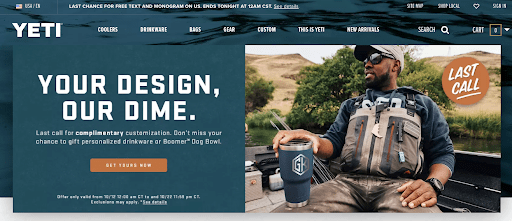
Source: Yeti
They use a sans serif font that looks blockish and has equal kerning. The simplistic look matches their brand well and is extremely easy to read.
6. Add Animation
People naturally notice movement first, so a little animation can go a long way. Here, Boie added animation that made it look like they were typing on their website banner.
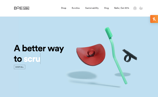
Source: Boie
Once it completes the sentence, it deletes the last word and replaces it with a new verb to describe their products.
7. Create Layers with Images, Text & Graphics
Making your website stand out can be a difficult task. Layering images, text, and graphics can help you create a unique look that portrays your brand effectively.
Paypal was able to add several important elements to their website banner, such as a QR code and phone number to help people subscribe.
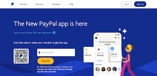
Source: Paypal
They also include a cartoon figure that appeared to be moving blocks onto an illustrated version of a smart device. It’s unconventional, but it’s interesting and it helps them target their primary audience — millennials.
8. Use Minimalism
Minimalist web designs are trending because they convey a sense of modernity. Additionally, it helps emphasize a site’s content rather than the web design.
Tinker, a custom watch company, epitomized minimalism when they created this web banner.
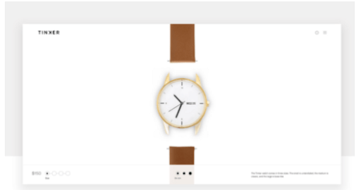
Source: UX Design
Tinker featured their logo, a few gray navigational elements, and a broken down watch.
9. Add Clickable CTAs & Buttons
Often, users visit a website with a specific goal in mind, whether it’s to purchase a new product or learn more about a service.
In response, featuring a CTA or a button that can redirect customers to what they’re looking for can help boost engagement on your site.
Wilderdog, a pet product company, does this by adding “shop outdoor gear” to their banners.
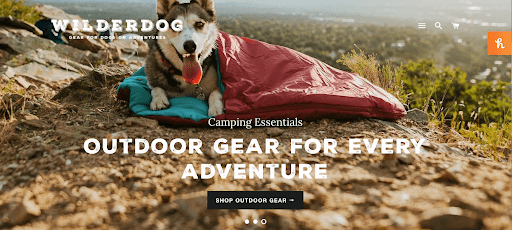
Source: Wilderdog
Once users click on them, they’re redirected to the site’s product page, where they can scroll through various products.
10. Promote Events
Many companies use their website banners to promote upcoming events such as sales and holidays specials.
This gets customers excited and encourages them to click through your site.
For example, Party City, a party supply store, created a custom banner with a countdown until Halloween.
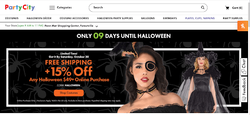
Source: Party City
Nearly a quarter of their annual revenue comes from the holiday, so promoting it makes sense. At the same time, it gets potential customers excited about dressing up and going trick-or-treating.
11. Create a Rotating Banner
Rotating banners move horizontally across the top of a webpage, allowing companies to showcase multiple products.
For example, this banner shows five outfits available on a retail site.
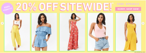
Source: Artonic
The images rotate like a carousel to show more options to viewers and increase engagement with the site.
12. Optimize for Mobile
On average, Americans spend over 5 hours a day on their mobile devices. The shift in how people surf the web and consume content changes has implications for modern web design.
Now companies must create mobile responsive websites. By providing a better UX to customers on mobile, you can grow credibility, improve your SEO, and increase sales.
To create a mobile-friendly web banner, you must ensure that your images and text can easily be read on a smartphone.
To improve your formatting, adjust your images so they fit on a smaller screen. Usually, 800 x 1200 pixels is the perfect size for a mobile device.
Home Depot’s website is mobile-friendly, so users can clearly see their web banners and get the same offerings.
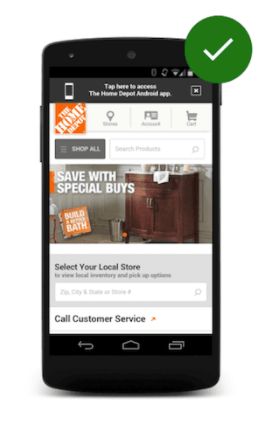
Source: Dinarys
Other pop-ups, such as the CTA that asks users to download the Home Depot app, are easy to bypass by clicking the exit button.
13. Sticky Your Banner
When you “sticky” your banner, users can still scroll down the page and access the information featured at the top of the page.
This is great for growing brand awareness and improving site navigation.
The Atlantic has done this on their news site.
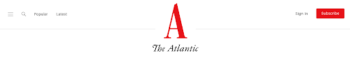
Source: The Atlantic
As readers scroll, the banner gets slightly smaller, but people can still see the title of the publication and the subscribe button and navigation features.
14. Add Video
Similar to animation, adding video to your website banner grabs your viewer’s attention with movement.
Austin Eastciders features a video of people hanging out and drinking their products in their banner.
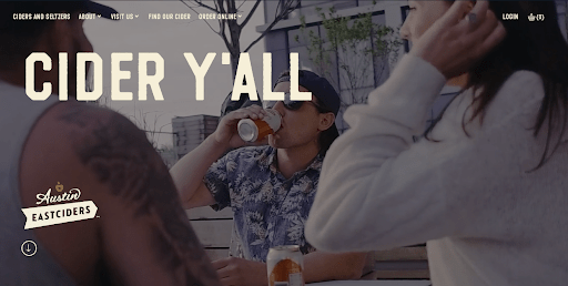
Source: Austin Eastciders
Not only does it stand out, but the video emphasizes their brand. The editing makes it seem casual and the footage is relaxed, showcasing that their products are best for casual drinking. Be sure to consult with an experienced web developer and SEO on how to implement video without compromising site speed.
Create a Unique Website Banner with These Ideas
Your website banner is the first thing a customer sees when they enter your website. Your banner needs to be eye-catching and intriguing for your customers to encourage a high click-through rate. At the same time, your design needs to match your brand guidelines to ensure a consistent user experience across your platform.
By following these tips, you’ll create an aesthetically pleasing site design that keeps users engaged.
A web design firm can also support you by proposing several different concepts aligned with your brand.
Need help selecting a company?
Based on your budget, timeline, and specifications we can help you build a shortlist of companies that perfectly matches your project needs. Get started by submitting your project details.