3 Parts of A Logo Key To Building A Brand Identity
Logos serve as visual representations of companies and their products. Audiences will remember and recognize your company through its logo, so each part is critical. Know the parts of a logo to design a unique and eye-catching image for your brand.
Updated March 4, 2022
When planning and designing branding elements, companies must think critically about how each component will be perceived by customers.
Strategically select and refine each part of the logo to ensure the final result embodies your vision. This task may seem daunting, but you can break the process down into digestible steps by focusing on the three main parts individually.
Evaluating your goals and ideas separately for each component will help you through the logo design process.
Are you designing a new logo for your business? Contact a logo design company to get started on your project today.
Need help selecting a company?
Based on your budget, timeline, and specifications we can help you build a shortlist of companies that perfectly matches your project needs. Get started by submitting your project details.
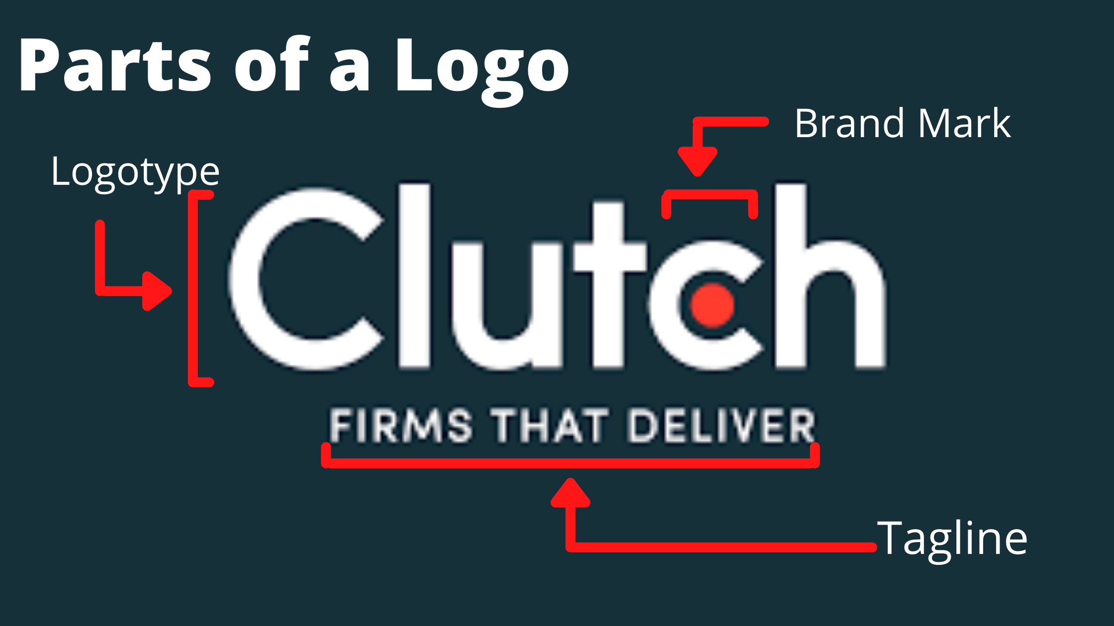
Parts of a Logo
Brand Mark
A prominent part of many logos is the brand mark. The term refers to an identifying image or symbol that a company uses to market its products.
Helping a business visually implement its brand identity into its logo, brand marks have very loose requirements. As such, they can take many forms ranging from abstract shapes and colors to more concrete branded assets.
Visible all across the Internet, the Twitter bird is a great example of a brand mark. 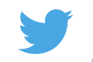
Source: New York Times
The blue bird is easily identifiable as a representation of the social media giant. In fact, the brand mark is so critical to Twitter’s identity that they have published guidelines on how it should be displayed on external sites.
Whether building a new logo or analyzing your current one, you should be sure that your brand mark is:
- Simple
- Easy for consumers to remember
- Dynamic
By balancing these characteristics, your logo will be more likely to resonate with your target audience.
Like Twitter, you should also ensure that your brand mark has consistent display guidelines. Too many forms or colors may confuse your customers and make your logo difficult to tie to your brand.
While it may seem like the least tangible part of your logo, the brand mark should not be overlooked. Successful brand marks are able to propel companies to new levels with consumers.
Logotype
When a company incorporates its name into its brand, this text is known as the logotype. A logotype easily ties a business’ identity into the logo. Nintendo, for example, employs a logotype in its logo.
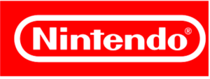
Source: 1000logos
In choosing to forgo a prominent brand mark in its logo, the construction of Nintendo’s logotype is crucial to its brand identity. The brand has used bolded text encircled by an ellipse as its logo for decades.
The logotype gives it a crisp, intelligent feel. A major challenge faced by companies is a difficulty in translating their logo to foreign markets.
Nintendo, whose overall success is tied directly to its prowess as an international video game purveyor, avoids this issue entirely due to the prominence of its logotype. With little graphical room for interpretation, the logo can be easily adapted for use in different countries.
When applying logotype best practices to your own brand, Nintendo is a great example to follow. Clear, intentional font choice in your text is key in building or maintaining your business’ reputation.
Additionally, while you may be tempted to leave a logotype out of your logo in the hopes of achieving a more innovative look, it’s important to analyze your brand awareness and target audience first.
Incorporating a logotype will help customers recognize your logo as being tied to your business. For example, firms operating in more conservative industries such as financial services tend to fare better with text-based branding.
Additional reading, “Typography in Logo Design: 4 Key Essentials.” and “5 Elements of Typography Layouts.”
Tagline
For companies looking to enhance the feelings-evoking qualities of their logo, a tagline can be a game-changer. Taglines are short, catchy sentences that tie to a brand’s identity and summarize a firm’s mission statement.
For retail mainstay Walmart, the tagline shown below is arguably the most memorable part of its logo.
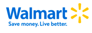
Source: Walmart
“Save money. Live better.” replaced the company’s previous slogan of “Always low prices” in 2007. Since then, it has become synonymous with Walmart’s mission of delivering a wide variety of items at the lowest possible prices.
With its tagline, the brand goes beyond focusing on product costs. Rather, it communicates that the savings will translate to a better standard of living for customers and their families. As with Walmart, businesses that employ a tagline are able to add additional value to their logo as a whole. T
aglines work best with new companies looking to establish a brand identity as well as those operating in crowded marketplaces, undergoing a rebranding effort, or lacking the budget for major marketing campaigns.
By incorporating a tagline into your company’s logo, you can ensure that any included brand marks or logotypes convey the ideal message for your brand.
4 Additional Logo Elements that Impact Your Brand
In addition to the primary parts of a logo, there are a few design elements that can impact the look and feel of your logo. As a result, they have a direct impact on your logo and
Shape
Shapes can evoke certain emotions and feelings, helping companies portray themselves in a certain way. For example, circles appear relaxing and casual, making them the perfect shape to accompany any spa logo.
Triangles, on the other hand, seem sharper and indicate authority. As a result, they’re great for tech and business companies.
To choose a shape for your business logo, think about what feelings you want your potential customers to feel.
Color
Colors are also a great tool that can capture your audience’s attention and sway their decisions. In fact, several studies have shown that color preferences greatly influence our choices.
Additionally, people tend to associate colors with certain feelings. For instance, cool colors such as blue, purple or green, evoke positive emotional responses. In contrast, warmer colors like red, yellow, and orange can trigger more intense emissions such as love, passion, and anger.
When choosing your brand colors, keep in mind that you’ll want to use them in your logo, web design, business cards, and other brand assets in order to establish brand recognition. Make sure that the colors you use reflect the tone of your business.
Framing
Some logos are framed — an ornamental shape around the primary logo that creates a vintage stamp feel. For example, Starbucks uses a framed logo with a circle around it.
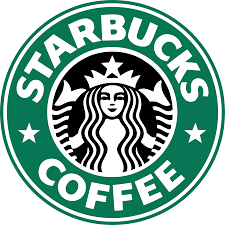
This look works really well with their brand because they’re able to use the logo on paraphernalia like their to-go cups, uniforms, hats, and more.
Negative Space & Background
Finally, designers need to focus on the negative space or background the logo is set against as well.
Providing enough space around the logo — known as padding — provides uniformity whenever the logo is used.
Additionally, designers should think about the backgrounds that the logo is likely to be used on. Usually, designers create logos with transparent backgrounds so they can be used on a variety of materials or background colors.
However, designers should still consider various options. For example, a black logo wouldn’t be very visible against a navy background. To combat this, designers might want to make various versions of the logo so it’s still recognizable.
Isolating Key Parts Of A Logo Aids The Design Process
Recognizing successful parts of a logo can be just as useful as selecting whole logos to inspire your projects. The three key components of a logo are the brand mark, logotype, and tagline. Examine each element individually to ensure that your brand is communicating effectively with its audience on a visual level.
Need Help Selecting a Logo Design Team?
We’ve created a directory of logo design firms to help you compare and connect with the right companies. Use client review ratings, services offered, and client focus to create a shortlist of logo designers. If you want personalized recommendations, share your project details with us.
Additional Reading
Need help selecting a company?
Based on your budget, timeline, and specifications we can help you build a shortlist of companies that perfectly matches your project needs. Get started by submitting your project details.