4 Digital Logo Examples For Logo Design Inspiration
Digital media is becoming increasingly prevalent, and consumers interact more and more with brands in online spaces. The average American’s screen time amounts to about 50 days per year.
This significant shift to online spaces and digital marketing has had a notable impact on logo design. Digital logos are logos that are designed to be viewed and interacted with online. As companies see their clients shift toward digital, they should consider implementing a digital logo.
Digital logos are internet and mobile-friendly. Logo designers employ unique processes and features to make digital logos stand out online. This article will showcase 5 digital logos and discuss why they’re effective in virtual spaces.
Need help selecting a company?
Based on your budget, timeline, and specifications we can help you build a shortlist of companies that perfectly matches your project needs. Get started by submitting your project details.
TikTok

Source: The Drum
TikTok, a recent entry to the social media marketplace, has arguably the most prominent platform with Gen Z users.
The video-sharing service boasts over 130 million monthly active users in the US. Referencing a dance, a trend, or even a series of financial facts seen on TikTok is becoming increasingly commonplace.
TikTok’s popularity is aided by its strong digital logo. It employs a white musical note accented by blue and pink that sits on a black background. The logo was conceived to evoke feelings of attending a rock concert.
However, from a digital media perspective, the logo helps the app it represents remain popular with its user base. The simple musical note is easy to scale down in size for a mobile app icon.
While the logo is not overly intricate, its bright accents contrast with its black background. This helps it stand out among other icons. The brand mark’s eye-catching nature entices users to open the app even when they did not originally intend to do so.
TikTok’s innovative digital logo enabled the platform to further its success with a growing user base in balancing scalability.
Robinhood

Source: Robinhood
Like TikTok, Robinhood is an app that has achieved sustained popularity. It's done this by appealing to a younger user base and by fostering a well-conceived digital logo.
The commission-free financial security trading platform uses a simple, feather-shaped brand mark that scales well to app-icon size. To make up for this simplicity, the logo intentionally packs in details that tie to Robinhood’s mission.
The feather itself ties the firm to the English folk hero Robinhood. Robinhood's story is one the company attempts to emulate with its services.
An upward arrow hidden within the feather symbolizes potential market gains. Even its bright green color is intended to be non-threatening and help connect with young investors.
With their meaningful brand mark, Robinhood makes every pixel of their app icon count. The logo supports the ongoing endeavors to maintain and expand the user base.
Lyft
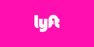
Source: Lyft
Ride-sharing mainstay Lyft operates almost exclusively via mobile phone. As such, maintaining a viable digital logo is crucial to their overall success.
Stemming from a previous partnership with a vehicle mustache manufacturer, Lyft’s logo uses bubble font with the company’s name set in white against a pink background.
This brand mark translates well to app icon form. Additionally, it goes against the grain of competitors’ prevailing design trends. Many tech companies, such as Lyft’s ride-sharing rival Uber, use serious fonts and dark colors in their logos. Lyft’s logo stands out from these, projecting a fun, friendly nature to users.
Lyft’s unique design choices translate well to a digital logo and should help the firm stand out and capitalize on its market share in the coming years.
Slack
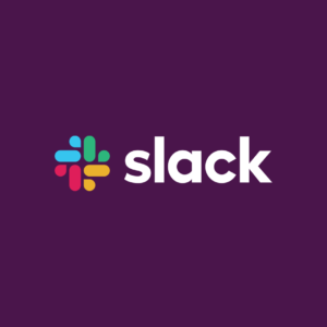
Source: Slack
Virtual workplace communication app Slack’s digital logo can be viewed as both an inspiration and a cautionary tale depending on your business’ brand position and target audience.
The company unveiled the new logo in 2019. Before this rebrand, they did not employ a cohesive brand mark.
The octothorpe figure that was central to many versions of their logo incorporated an exhausting 11 colors. If the company did not set these colors against a white background and at an 18° angle, the logo would not display correctly.
To rectify the issues with the existing logo, Slack distilled its brand into a more abstract logo with four colors that would not need to be displayed at a specific angle. The simpler logo did not require a white background and could be easily scaled.
However, the creators of the new logo overlooked how the new app icon compared to the old one. One of the main complaints from Slack users was that the new logo made the app’s icon darker and more challenging to find on mobile or desktop screens.
With the firm making its debut on the New York Stock Exchange later in 2019, perhaps they felt a less bold brand mark would help the firm be taken seriously by investors. Still, the shortcomings of the new digital logo from an app icon standpoint did not sit well with some users.
Digital Logos Are Best For Online-First Businesses
Digital logos are meant to serve businesses that are interacting with customers in a virtual capacity most often. TikTok, Robinhood, Lyft, and Slack can act as inspiration for businesses searching out the perfect digital logo to represent their brand.
Need help selecting a company?
Based on your budget, timeline, and specifications we can help you build a shortlist of companies that perfectly matches your project needs. Get started by submitting your project details.