5 Tips to Redesign Your Logo
- Stick to Your Brand
- Choose The Logo Type
- Pick Colors and Fonts Carefully
- Look to the Past
- Be Distinct
Need help selecting a company?
Based on your budget, timeline, and specifications we can help you build a shortlist of companies that perfectly matches your project needs. Get started by submitting your project details.
Stick to Your Brand
Before launching a logo redesign, it is critical to know your company’s brand. This includes your company’s target audience, messaging, and value proposition. A logo is meant to reach a particular audience, which is why it’s crucial to know what your business is all about. Your logo concept should reflect the nature of your business while projecting itself within the market. Since its inception, American Airlines has kept their main elements in each logo redesign project. Each redesigned logo has included an “AA” and an eagle. 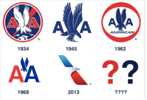 Source When their latest logo iteration launched in 2013, their “flight symbol” logo worked to evoke the iconic elements while creating a vibrant look. Along with evoking elements of logos past, the redesigned logo embodies the spirit of flight, which is key for any airline.
Choose The Logo Type
Are you looking to create a complex logo design or something simple? For businesses, this is a decision that might not come top of mind. But the choice is likely simple. Companies need to think about what they want their logo to stand for. What is the main feature? A picture is worth a thousand words, but does your brand want your company’s name at the forefront? A logo is a type of brand advertisement, so it is important to think about what your logo features. For businesses to gain more visibility, it might work to use your company name at some focal point within the logo. You can use the name as a standalone or in combination with a symbol or image that corresponds with that name. For brands looking to redesign their logos with just a symbol or image, that might involve more thinking. If your company is already well-known in the space, it might be easy to get away with. For example, Apple has enough brand recognition at this stage to avoid using their company name. 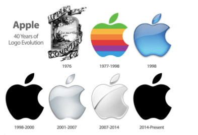 Source A combination of company name and symbol could be the best bet for companies that are looking to build up their customer awareness and reputation in the market.
Pick Colors and Fonts Carefully
To create a powerful logo design, color and font (if used) choices should be specific to your brand’s personality. Bright and bold colors grab attention, but make sure each color reflects your brand and messaging. For example, if you’re a company that’s invested in environmental incentives, your color scheme is likely green or various earthy tones. You should use those colors in your logo, and not something like red or pink, which would detract from your company’s mission. If your logo is using fonts, it is important to consider readability in your selection process. If customers can’t easily decipher the message your company is trying to convey, your branding efforts are somewhat null. Going through a redesign logo project, it is key to not go overboard with a new font that might alienate loyal customers. Select a font that fits with your target audience and brand personality. Try to be unique, but avoid using fonts that are unrecognizable and gimmicky. Putting the right colors and font styles as part of your logo can speak volumes for your brand.
Look to the Past
When redesigning a logo, it is essential that logo designers look toward the past. While a main reason for a redesigned logo is to appeal to new customers and modernize, it is also important to stick with what works. Bacardi’s logo has become one of the most well-known logos in the alcohol industry. All because of a black bat. Over the years, the brand has remained consistent with color and symbol. The red and black color scheme with the bat emblem has gone through some tweaks since 1890. 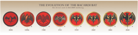 Source When the logo is redesigned, elements are mainly revamped. The bat has become more stylized and accented throughout the year, but the main symbol has stayed the same for more than 100 years. As brands evolve, companies like Barcadi must consider the fundamentals of their business success before making drastic changes.
Be Distinct
A logo must strongly resonate with your customer base. It is important for any logo redesign project to prioritize distinction when making creative decisions, In other words, how can your logo stand out? Logos can be distinct because of color choices, symbol designs, hidden messages, and more. Fandango’s logo adds a little flair in its design – making it stand out from other movie ticketing and review platforms. The use of blue and orange as an accented color draws attention. 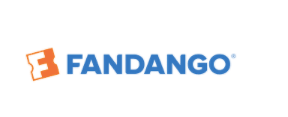 Source The hidden “F” in the logo’s symbol is playful, definitive, and intriguing – similar to an experience at a great movie.
Redesign Logos With Purpose
For all redesign logo projects, it is important that brands make changes with a purpose. A successful logo redesign project relies heavily on inspiration and strategy. Businesses can follow these five strategic tips to make the process move smoothly:
- Understand your brand completely
- Pick the right type of logo that will leave the right impression
- Use color schemes and font styles that will promote your brand
- Utilize past iterations of logo designs to create a modernized look
- Remain distinct in order to attract customers and stand out in the market.
Try a couple of iterations to find a logo redesign that fits and feels right for your brand.
Need help selecting a company?
Based on your budget, timeline, and specifications we can help you build a shortlist of companies that perfectly matches your project needs. Get started by submitting your project details.