What Is Editorial Design? The Basics You Need to Know
Editorial design refers to designing pages and screens for content-driven publications such as newspapers, magazines, books, and even websites.
Editorial graphic designers need to think about typography, layouts, graphics, and images to create a comprehensive editorial design.
Although these may seem like small details to the layperson, editorial design is important because it impacts how people understand written texts.
Whether you’re a business leader looking to post engaging, SEO-friendly content, a magazine publishing regular print and digital content, or even a book publisher, your editorial design can dictate how well your editorial content is received.
Whether people are reading your content digitally or on print materials, your design can impact circulation, impressions, reach, and even brand loyalty. Therefore, editorial designs must be appealing and easy to read.
Here are basic editorial design principles to guide your design efforts.
Need help selecting a company?
Based on your budget, timeline, and specifications we can help you build a shortlist of companies that perfectly matches your project needs. Get started by submitting your project details.
4 Editorial Design Principles
- Use Grids
- Create Hierarchy
- Feature Images
- Consider Cross-Platform Ramifications
1. Use Grids
Grid layouts help align and balance your design by creating structure. As a result, your design will appear neater and more organized.
This is particularly important for editorial design because it improves readability and provides clarity.
A grid design is based on overlapping columns and rows, creating a series of blocks. However, there should be smaller gutters and margins to create space between each block and maintain visual balance. A basic grid design looks something like this:
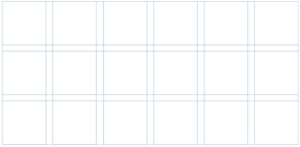
Source: Visme
Most graphic designers use grids to make sure that everything is lined up and whitespace is used effectively.
Although this may seem pretty basic, top designers get creative with grid layouts by grouping blocks together based on the types of content they’re featuring. Editorial designers often use several templates for different pages.
Below are a few ways designers can change their layout to showcase their content, create balance, and enhance their visual hierarchy.
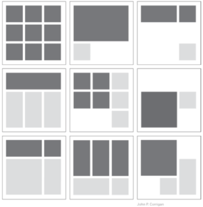
Source: Design Lab
Imagine that the dark gray represents images and the light gray represents text. This graphic shows that there are several ways for designers to reorganize content using similar grids.
Rolling Stone, for example, uses a four-column grid layout on their homepage to create a clean and cohesive design.
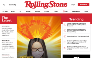
Source: Rolling Stone
The top row features their brand name and their navigation bar. Underneath that, the leftmost column features the latest news articles while the rightmost column lists trending articles.
At the center of the page, they feature a clickable image that leads to a popular article they want to promote. As readers scroll down, they’ll see more feature articles and reviews. Each clickable image and title featured on the site is aligned, creating a crisp look for the platform.
At the same time, the space between each element is even. The whitespace ensures that the site isn’t cluttered and readers can find what they’re looking for.
2. Create Hierarchy
Hierarchy is a design principle that shows what’s most important on a given page or screen. One way to create hierarchy in editorial design is through typography. The typeface, font, color, and size of your text guide your readers through your content.
Readers will be drawn to bright colors and large fonts first, so use those strategies to draw attention to the most important aspects of your content. This is why titles and headers are often larger than the rest of the content on a page. Designers can also play around with the style of their text here to contrast the body.
Generally, body content has a simple font and is black against a white background for accessibility reasons. Times, Helvetica, and Verdana are popular font choices because they’re easy to read.
Consider this magazine layout:
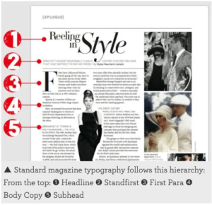
Source: Graphic Violence
This page uses five different text formats. The headline, “Reeling in Style” is larger, bolder, and uses a softer font like script to grab the reader’s attention. Under that is the standfirst or intro text. It’s in a lighter color, gray, and is in all caps.
To mark the beginning of the article, the designer used a large, bold letter to draw eyes to the main part of the page. Finally, they chose to break up the text with subheadings similar to the intro text. This breaks up the text and makes it easier to skim.
3. Feature Images
Blocks of text are overwhelming and difficult to consume. Images that illustrate what the content is trying to convey can help readers understand the text. After all, a picture is worth a thousand words.
Of course, there are plenty of ways to incorporate images into your editorial design. Depending on your brand and the content of an article, you can use graphics, pictures, infographics, and illustrations to drive your point home.
Play with the sizes and locations of your images to make sure that they’re being used effectively. For example, some magazines often use a full-page — or even a double-page spread — to create pacing. This is important because it signals to a reader that they’re moving into a new section.
If you’re working on a digital platform, consider using other elements like animations or videos to make your page a little more unique.
Remember: these images can help you create a brand image. Choose what images you select carefully.
4. Consider Cross-Platform Ramifications
In today’s day and age, your content must be compatible on multiple platforms. Websites are viewed on both desktops and mobile devices. Similarly, books and magazines are consumed both in print and digitally, and even newspapers are viewed online.
Consequently, your editorial design needs to be responsive. By creating a standard UX across multiple platforms, you’ll enhance usability and improve search rankings.
Consider working with a graphic designer and web designer specializing in mobile-friendly development to make sure your designs suit your needs.
Improve Readability with Editorial Design
Editorial design is important because it affects readability. Web pages and print materials need to be clean and organized but still be engaging for readers.
While grids help keep page layouts organized, designers can still come up with creative solutions to showcase content. They use elements such as typography to grab the reader's attention and guide them through the text.
Images also help break up text and engage readers. Although they’re visually appealing, they also serve an important design purpose — pacing.
Finally, make sure your design is compatible across multiple devices. You want to make sure your editorial designs are visually appealing regardless of whether or not they’re viewed in print, on desktops, or even mobile devices.
Need help selecting a company?
Based on your budget, timeline, and specifications we can help you build a shortlist of companies that perfectly matches your project needs. Get started by submitting your project details.