4 Graphic Design Concepts to Improve Your Designs
These graphic design concepts will guide your viewers' eyes to the most important elements of your composition. As a result, you’ll build positive first impressions, establish credibility, and distinguish your business from your competitors.
Graphic design is a visual tool that helps businesses and other organizations convey their most important messages. Consequently, it’s a critical part of your company’s marketing efforts.
By creating consistent imagery that portrays your brand well and conveys credibility, your organization will stand out and appeal more to customers.
Great graphic design companies know how to use these elements and general guidelines to create engaging graphic designs that capture your audience’s attention:
- Rule of thirds
- Visual hierarchy
- Color
- Unity
Need help selecting a company?
Based on your budget, timeline, and specifications we can help you build a shortlist of companies that perfectly matches your project needs. Get started by submitting your project details.
1. Rule of Thirds
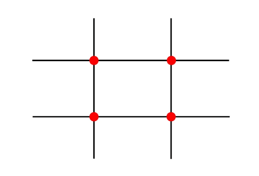
The rule of thirds is a simple design technique that designers use to create balance in their composition. They divide their page with two equally-spaced vertical and horizontal lines, creating three columns and three rows, and a nine-block grid.

Source: Lightroom Presets
By placing the most important elements of your design where the lines intersect, you can create a striking composition that effectively draws your viewer’s eyes to the most important parts of the page.
For example, this Corona Extra ad perfectly uses the rule of thirds to display their product and their message.

Source: Robert Katai
By aligning the beer bottle with the vertical line on the left, it gets the most attention. Then the text is centered around the bottom right focal point to create balance in their image.
2. Visual Hierarchy
At the end of the day, the main purpose of your graphic designs is to convey a message. By arranging your elements carefully, you can emphasize the most important features and highlight your message.
Here are some general guidelines that can help you establish a visual hierarchy in your composition:
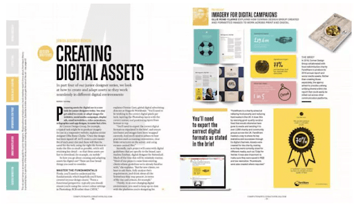
- Large elements stand out, so make the most important elements larger. This is why titles and headers are often several sizes bigger than other types of text. For example, consider the editorial layout below:

Source: Creative Bloq
The title is the largest, drawing the most attention. However, the intro text, subheadings, and quotes are also bolded to draw attention to them as well.
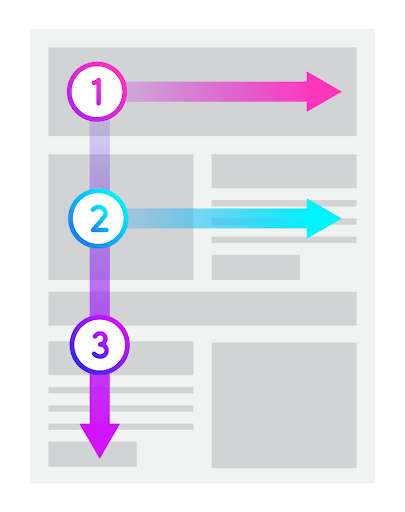
- Consider the position of your elements. English speakers usually follow an F-shaped reading pattern, so their eyes are drawn to the elements featured at the top of the page first.

Source: MediumTo create visual hierarchy, organize your page in order of importance and put the most important elements at the top of your design.
- Use leading lines to draw attention to the focal point of your design. For example, this company used both wide and narrow lines to create visual paths between various sections.

Source: Design ModoThe lines do a great job creating movement and drawing the viewers’ eyes to the center of the page. As a result, the page’s title and their company description stand out on the page.
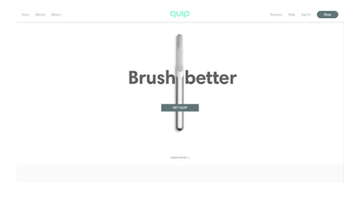
- Use space effectively — additional whitespace serves to emphasize certain elements, while elements that are close to one another seem related. Modern trends focus on a minimalist look, which you can create by scaling down your graphics to increase your whitespace.

Source: Impact PlusFor example, quip, the eco-friendly dental hygiene company, showcases their product on their homepage by placing it at the center of the page with a simple sans-serif text, and a clear CTA. As a result, it’s the first thing a potential buyer notices when they visit their website.
By implementing these strategies, you can create a graphic design that is visually appealing and emphasizes the most important elements of your design.
3. Color
Color is one of the most important elements of your design. It dictates the mood of your composition, conveys your brand, and helps you create visual hierarchy by highlighting the most important elements of your brand.
According to our recent survey, color can have a huge impact on sales and how people perceive your brand. Here are some of our key takeaways you can use to elevate your design:
- Use cool hues, such as blue, purple or green, to evoke a positive emotional response
- Avoid color overload with whitespace
- Use bright colors such as green, pink, and blue to draw attention to content
- Consider using primary colors, such as red, yellow, and blue because they’re preferred by most audiences.
- Avoid yellow and orange, which can create color fatigue and create negative associations.
- Create contrast, but make sure the colors complement each other.
Whether you’re creating an ad, designing a website, or developing an interesting infographic, these guidelines can help you improve your design and make your elements pop. However, be mindful of the colors you choose — they should still reflect your brand.
4. Unity
Unity is when all of the elements of your composition work together to create a visually appealing design that communicates your message effectively.
Graphics that display unity can help your business build positive first impressions, establish credibility, and distinguish you from your competitors.
To achieve unity in your composition, you must bring together the six other design elements:
- Balance — The equal distribution of weight in a composition.
- Scale — The relative size of different elements in your design.
- Contrast — Creating opposition by adding elements of various colors, shapes, and sizes.
- Repetition — By repeating similar elements, you can create a cohesive look and develop structure throughout your design.
- Movement — Using different elements to guide your audience’s attention throughout the composition.
- Emphasis — Draw attention to the most important aspects of your design using leading lines, bright colors, varying textures, and unique shapes.
As you’re bringing your design together, each element should complement one another to create a harmonious look.
Graphic Design Concepts You Should Implement
Visuals are key to attracting customers and making your brand stand out. Eye-catching graphic designs use the rule of thirds and visual hierarchy to draw attention to the most important elements of your design.
They also use colors to dictate the mood of the composition, create positive associations, and highlight certain elements.
At the same time, each element of your composition should compliment each other. In doing so, you’ll create unity and develop an aesthetically pleasing design.
Need help selecting a company?
Based on your budget, timeline, and specifications we can help you build a shortlist of companies that perfectly matches your project needs. Get started by submitting your project details.