7 Magazine Ad Design Tips
With millions of readers every year, magazine ads are a great way for brands to reach their target audience and leave a lasting impression. Follow these 7 magazine ad design tips to create an eye-catching and memorable ad.
Think print is dead?
Think again.
An annual study revealed that the total number of magazine readers in the US has remained consistent over the last 10 years — about 220 million people read magazines every year.
Despite a growing interest in digital media, magazines have proven to be adaptable and resilient. In fact, most readers still prefer print magazines over digital formats.
Through magazine advertising, you can establish brand credibility, reach your ideal audience, and leave a lasting impression.
Need help selecting a company?
Based on your budget, timeline, and specifications we can help you build a shortlist of companies that perfectly matches your project needs. Get started by submitting your project details.
3 Advantages of Magazine Advertising
- They‘re memorable — print ads, such as magazine ads, are more memorable different magazines appeal to different audiences. For example, you can reach a young female teenage audience by advertising in Teen Vogue but a more mature male audience in Men’s Health.\
- Targeted reach — different magazines appeal to different audiences. For example, you can reach a young female teenage audience by advertising in Teen Vogue but a more mature male audience in Men’s Health.
- Establish credibility and brand recognition — Thanks to cybercrime, bad online marketers, and glitchy websites, magazine ads are still considered more trustworthy than digital ads.
Are you planning to invest in magazine advertising? Find a leading ad agency on Top Design Firms. Search based on location, services offered, and minimum project size to find the perfect partner for your project.
6 Tips for Magazine Ad Design
If you plan to invest in magazine advertising, the look of your ad is key for capturing your audience’s attention.
Additionally, the visual components of the ad should reflect your brand, emphasize the value proposition of your products and/or services, and, most importantly, appeal to your customers.
If the ad isn’t visually appealing, it will fail to leave a lasting impression on consumers and convert them.
- Create a Balanced Design
- Use the Gestalt Principle
- Develop Clear message
- Highlight Branding
- Use Color
- Focus on Typography
Create a Balanced Design
In graphic design, balance is when the weight of the design’s components seems to be evenly spread. This creates cohesion and is aesthetically pleasing to people. Without it, your ad’s message can become lost in the design.
To achieve balance, designers strategically use objects, colors, textures, space, and motion to create their layout.
The rule of thirds is a design technique that helps create balance in an ad design. By dividing the page with two evenly spaced vertical and horizontal lines, you can create a 3x3 grid.
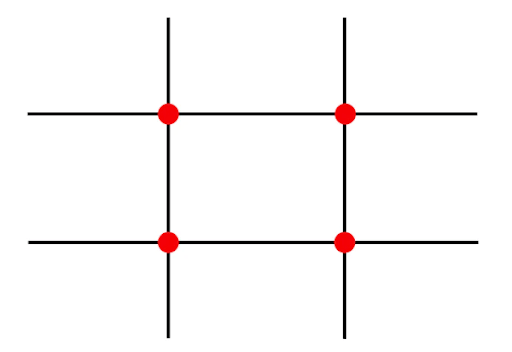
Source: Lightroom Presets
By placing the most important elements of your magazine ad design at the intersection of each of the lines, you can create balance in your design.
For example, this McDonald’s ad is very well balanced because the horizon line aligns with the top line, while the cow is placed between each intersection point.
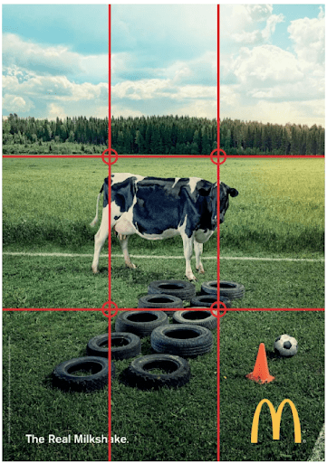
Source: The Essential Guide to the Rule of Thirds
The result helps catch a reader’s attention and draws their attention to the most important information on the ad.
Thanks to the ad’s strategic layout, readers will recognize the cow first, followed by the tires and the caption, “The Real Milkshake.” Within seconds, they can understand the joke — by running through the tires, the milk in the cow’s udder with be shaken.
Without a balanced design, the reader may not spend enough time trying to understand the ad, and the ad itself will become less effective.
Use the Gestalt Principles
The Gestalt principles are rules that outline how people recognize patterns and perceive complex images. Based in psychology, these laws help advertisers understand how the human brain works and how to appeal to it.
By using these laws in a magazine ad design, companies can catch their readers’ attention and leave a lasting impression.
What are the Gestalt Principles?
- Law of Closure – People prefer whole and complete forms, so their brain will automatically fill or close spaces.
- Law of Similarity — People group together elements that are similar in shape, color, or size.
- Law of Proximity — People perceive design components that are close together as a single unit.
- Law of Figure-Ground – People tend to perceive the first element that catches their attention as a primary figure in the foreground, while secondary elements are considered background.
- Law of Multistability — People can have multiple interpretations od an image, but they perceive them in a discontinuous manner.
- Law of Common Fate – People perceive design elements that move in synchrony as one.
- Law of Continuity — People avoid sudden change in direction and interruptions. Instead, their eyes will follow lines in one direction.
- Law of Good Form – People prefer harmonious designs that are balanced, symmetrical and simple.
- Law of Past Experience – People tend to recreate objects they’re familiar with in their mind.
Additional reading, ‘The Gestalt Theory And What It Is.’
So how can ad designers use the Gestalt Principles to create a striking magazine ad design? Consider this Coca-Cola ad:
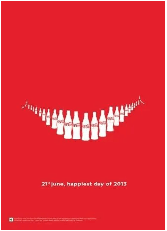
Source: eos Marketing
Through the law of proximity, the magazine design is able to create an image that, at first glance, appears to be a smile, when in reality it’s just a bunch of Coca-Cola bottles organized near one another.
Symbolic of happiness and joy, the smile helps Coca-Cola communicate their brand message to their audience. Overall, it communicates that a Coke can make consumers feel happy.
Develop Clear Message
Magazine ads that focus on a single message are more effective. Rather than adding lots of copy that overwhelms the ad, advertisers should focus on one key item.
There may be a dozen benefits for a product or service, but if a bunch of text covers the page, the reader won’t be able to concentrate on any of it.
By focusing on one point and keeping copy to a minimum, companies can make their messages more powerful.
In this magazine ad design, the World Wildlife Foundation (WWF) used just three words to create a powerful statement that resonates with their readers.
As, a non-governmental organization that’s dedicated to environmental preservation, WWF wanted to promote conservation, particularly for marine animals.
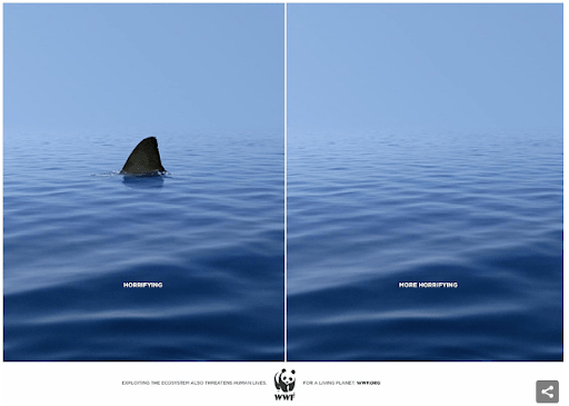
Source: Bored Panda
On one side of the ad, they showed an open ocean with a shark fin. Underneath is one word, “Horrifying.”
On the other side, the image is exactly the same except there is no shark fin. The text reads, “More Horrifying.”
The message is clear: while many people are scared of sharks, they have a more important role in our ecosystem. Losing them would be devastating to the food chain and have a lasting impact on the health of our oceans.
Through this magazine ad, WWF seeks to inform audiences and raise money for conservation, responsible trade, and responsible fishing solutions.
Highlight Your Brand
A logo, a brand name, and even the colors are associated with a company’s brand.
These brand assets are how consumers recognize and recall a company. As such, they’re key to a business’s identity. Having a strong, consistent, and recognizable brand helps companies differentiate themselves from competitors.
By including brand assets in a magazine ad design, companies can improve brand recognition and increase sales. With just a logo or a brand name, consumers will be more likely to recognize the brand in the future or look them up online to make a purchase.
For example, the athleticwear company, Nike, includes their iconic swoosh logo on all of their magazine ads. Thanks to brand consistency, it’s estimated that 97% of Americans recognize the logo.
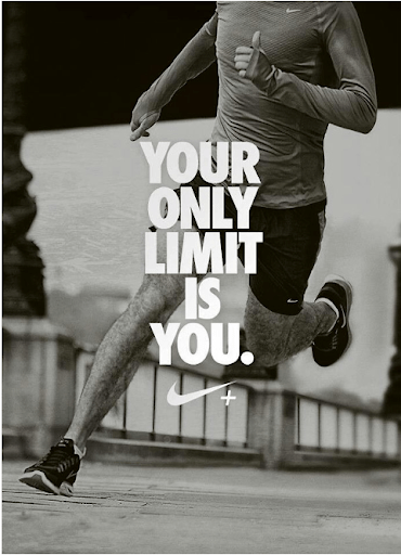
Source: The Big Ad
Even without the company name, consumers immediately know that this ad is promoting Nike’s products thanks to the swoosh. The logo appears just below the primary message, “Your only limit is you.”
Nike often uses emotional slogans like this to inspire their customers and tell a meaningful story. Wanting to work hard, perform, and succeed, many customers turn to Nike because of the brand’s emotional tug.
Assuming the ad compels their audience enough, buyers looking for new running shoes or workout shorts to look for Nike products first.
Additional reading, ‘Brand Attributes: Definition, Benefits & Examples.’
Use Color
Colors are important branding tools, but they also convey the mood and tone of an ad and can provoke certain emotional responses of a consumer.
For instance, red expresses anger and danger, but it also stimulates a person’s appetite, so it’s particularly effective for food ads.
Blue on the other hand conveys a sense of calm and authority. As such, it’s particularly effective at establishing credibility and compelling people to buy on impulse.
Additionally, colors can help capture an audience’s attention and draw their eyes to certain design elements. Contrasting colors, for example, tend to stand out more on a page.
To design a magazine ad that stands out, is branded, and visually appealing, ad designers need to consider the colors they use carefully.
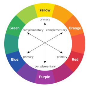
Start with your brand colors and play with different shades, hues, and tones to find a combination that works well together.
Source: Peachpit
Then use the color wheel to create a color palette that compliments your brand colors and reflects the tone of your ad.
Additional reading, ‘How Your Website Can Use Colors that Increase Sales.’
Focus on Typography
Typography is the design of letters and text. Choosing the right typography is an essential part of a magazine ad design because it can help create brand awareness and deliver a message.
In fact, a simple font choice can have a huge impact on the emotion and tone of an ad. For example, script fonts, which are more fluid, are considered more feminine and casual. In comparison, sleek, modern fonts are considered more professional and masculine.
However, typography isn’t just about style: it also needs to be functional. More important than design, the message needs to be legible.
This is where graphic design comes in. Expert designers can create original typography that reflects a brand’s image but is still readable.
Consider how Toyota used typography to send a message:
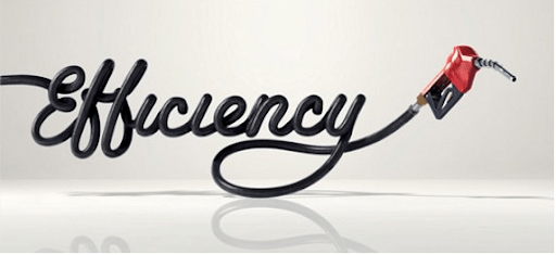
Source: AD World
They used a gas line and a gas pump to spell out the word, “Efficiency” in a loopy script font. In doing so, they were able to advertise their recent efforts to create more environmentally-friendly cars.
At the same time, they didn’t sacrifice their message for style — it’s still easy to read.
Additional reading, ‘5 Typographic Ads & What You Can Learn From Them.’ and ‘Typography Design: 5 Elements in Typography Layouts.’
How Much Does it Cost to Put an Ad in a Magazine?
On average, magazine ads cost between $500–$250,000 depending on:
- The magazine‘s circulation
- Whether the magazine is local or national
- The magazine‘s primary audience
- The size of the ad
- Location of the ad
- Color vs. black and white
- If you’ve negotiated a rate for multiple ads
Of course, each magazine offers different rates. To determine if you can afford to advertise with a certain magazine, you need to contact them or review their rates online.
Magazine Advertisement Rates For Leading Consumer Magazines
According to Statista, these publications are among the leading consumer magazines in the US. Here are their rates for a full-page ad in color. Click on each link to learn more about each magazine‘s ad rates.
- AARP Magazine - $782,150
- Better Homes and Garden – $495,400
- People – $402,900
- Good Housekeeping – $335,050
- Southern Living – $298,400
Need help managing your ad spend? Contact a top media planning and buying expert.
Leave an Impression With Great Magazine Ad Design
Despite growing interest in digital media, magazines are still a great way for brands to grow awareness among their target audience. Magazine ads are memorable and are great for building credibility.
The key to magazine advertising is to create an eye-catching ad design that pops off the page and leaves a lasting impression.
Using design principles and color, graphic designers can create interesting and unique layouts that appeal to readers.
Combined with brand materials and messaging, these ads can provoke emotional responses from readers, increase sales, and grow brand recognition.
Are you planning to invest in magazine advertising? Find a leading ad agency on Top Design Firms. Search based on location, services offered, and minimum project size to find the perfect partner for your project.
Need help selecting a company?
Based on your budget, timeline, and specifications we can help you build a shortlist of companies that perfectly matches your project needs. Get started by submitting your project details.